VT Markets App
UI/UX, 3D motion and a shared design system for a mobile trading app.
At VT Markets, my work covered mobile UI/UX, the shared design system, and onboarding visuals and motion created in Blender. This case follows the experience from first launch and account setup through trading, funding and regional adaptation.
First launch: 3D and motion
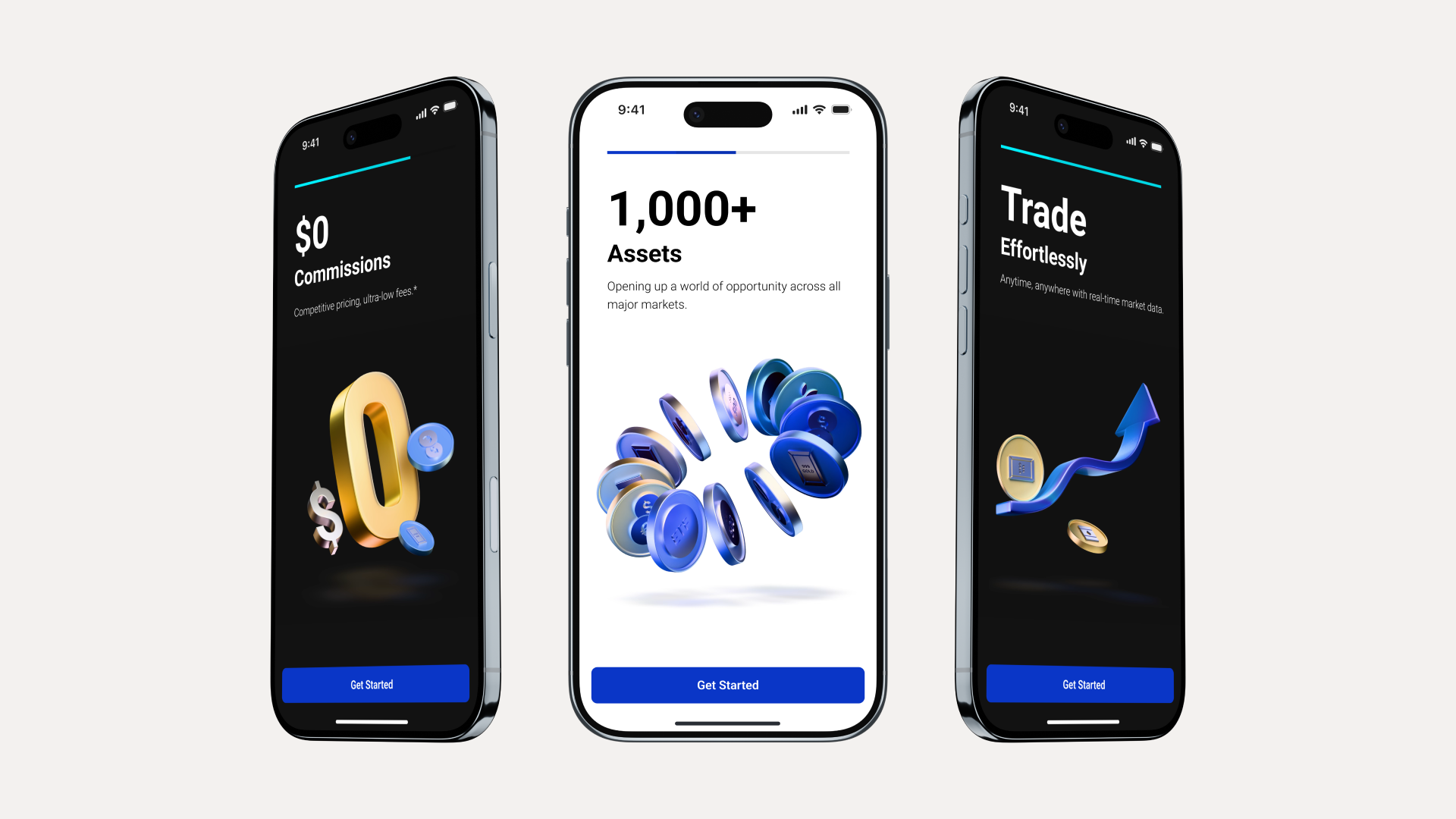
The first-use experience introduces the app through 3D visuals and motion. I created the artwork and animation in Blender, working with form, materials, lighting and timing to carry the brand into the product.
Introduce the app through motion
Four animated introductions establish a consistent visual language before users reach the home screen.
Carry the visual language into dark mode
The dark screens retain the same content hierarchy and 3D subjects, with surfaces and contrast adjusted to the theme.




From first visit to a ready account
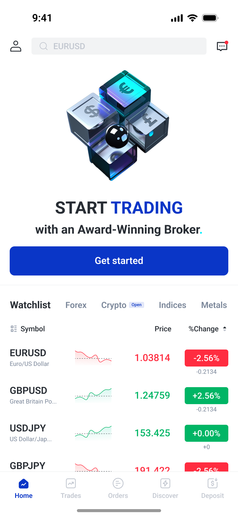
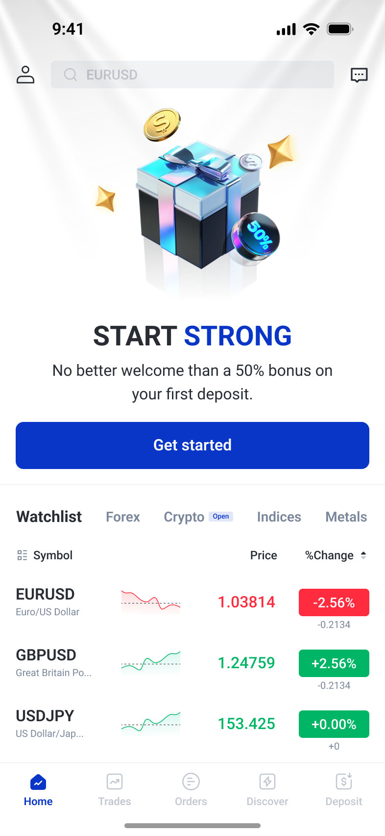
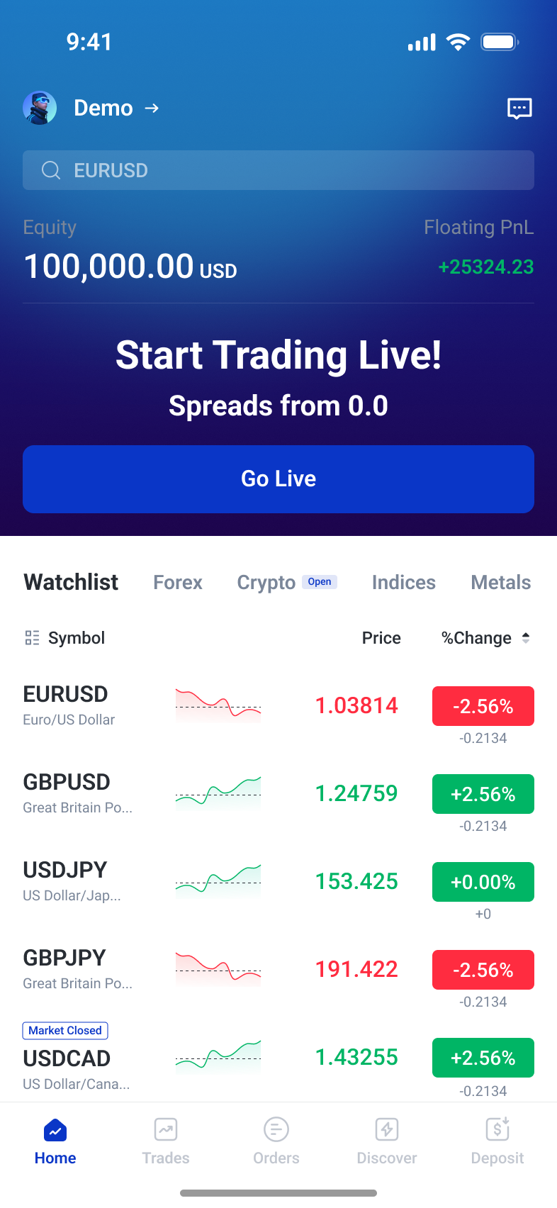
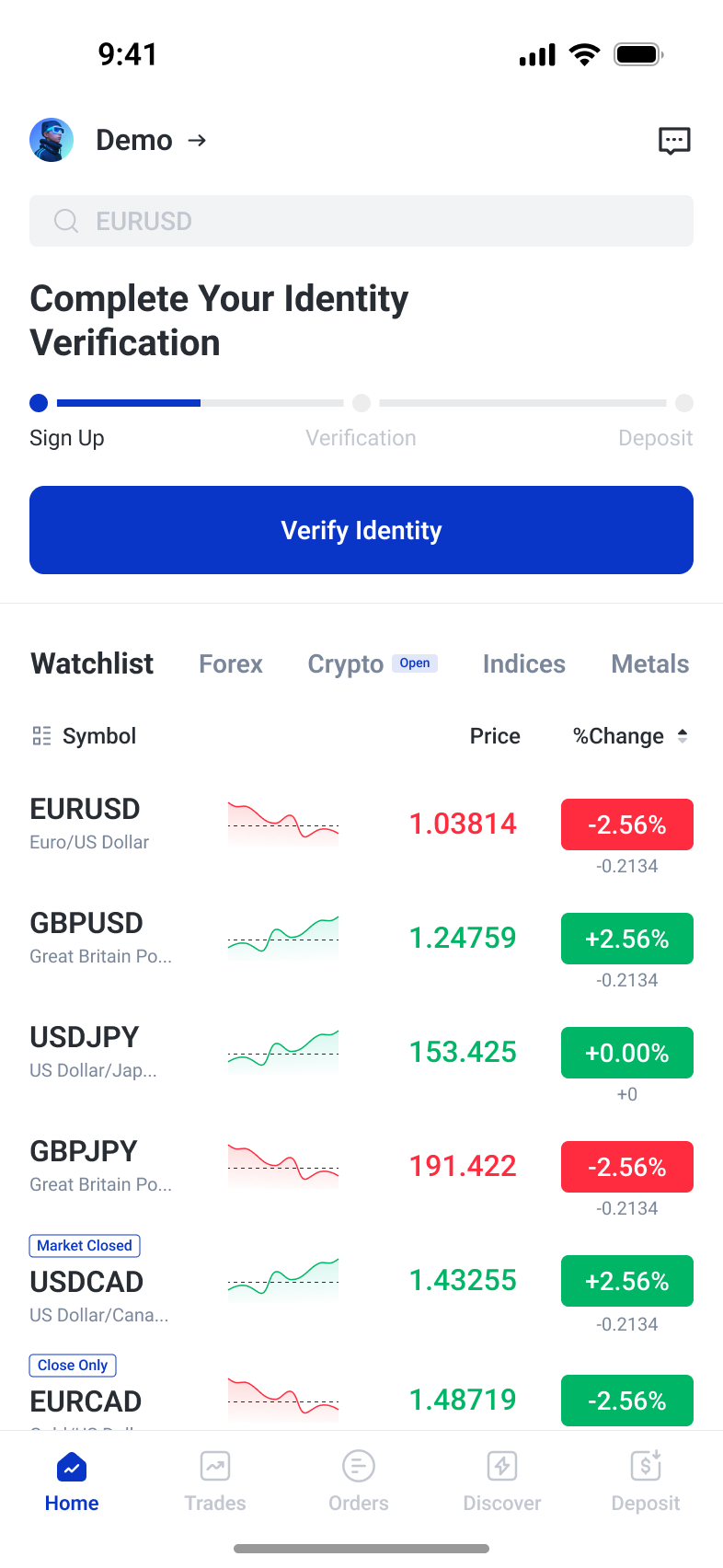
Market information stays visible before sign-up, alongside a clear Get started action. After registration, the home screen adapts to demo trading, identity verification and funded use. Setup separates key account choices, while contextual guidance supports the verification steps.
Explore before creating an account
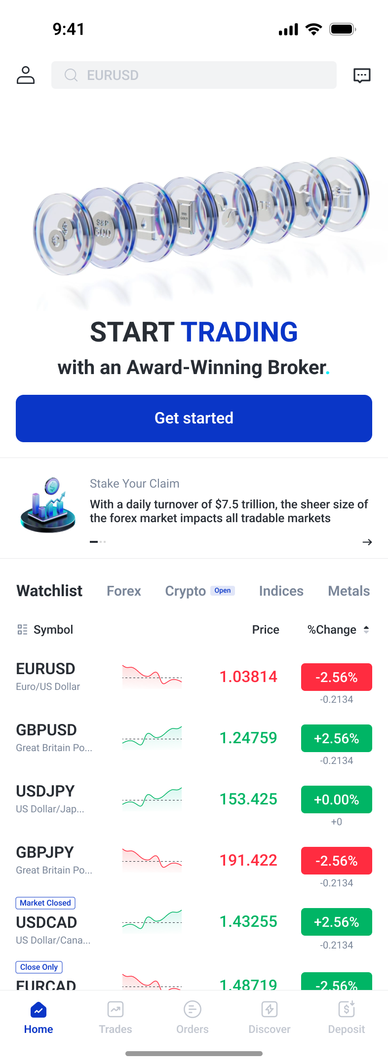
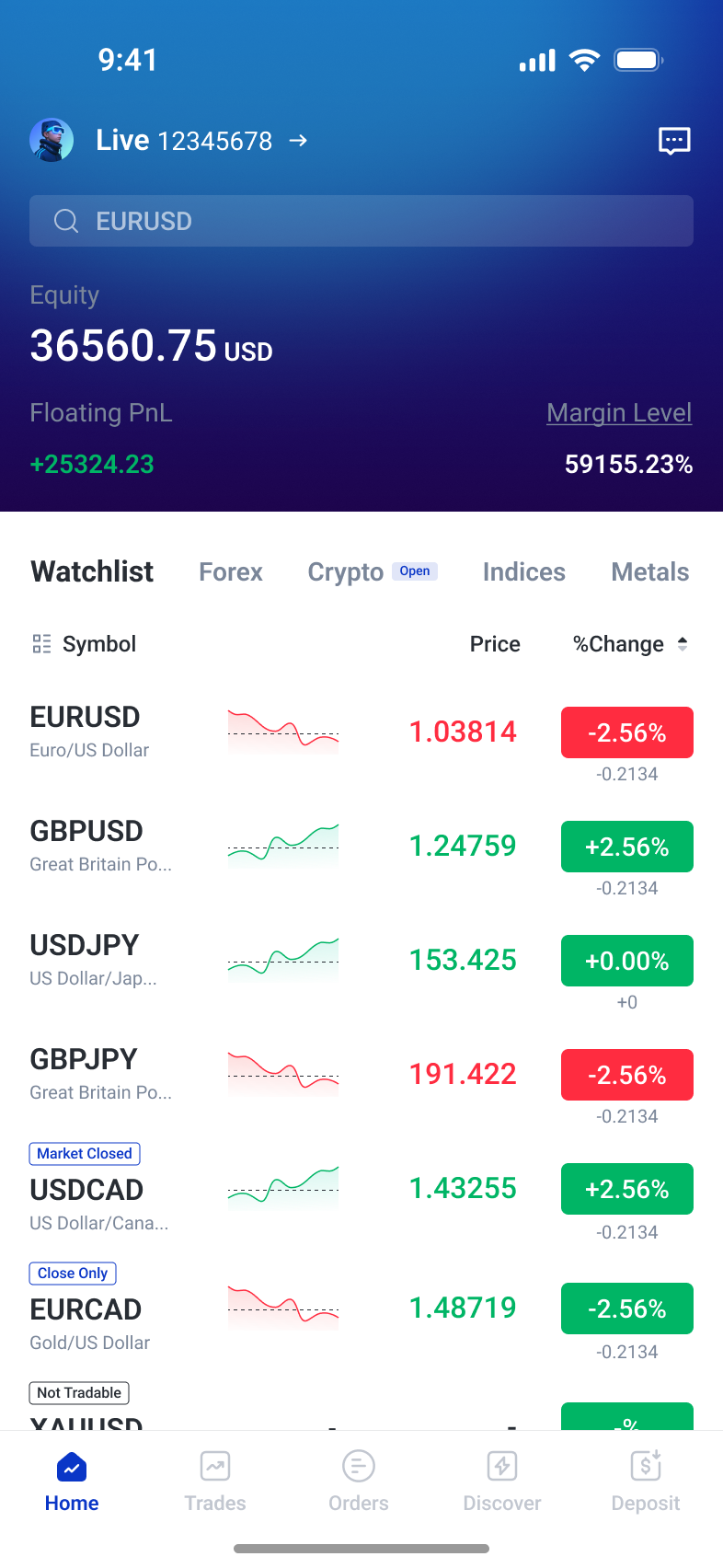
The first visit pairs a clear Get started action with visible market information. The full home page, compact layout and welcome offer share the same navigation for profile, search and messages.
A home screen that reflects account progress
Demo, verification, and funded states share a familiar market list. The account area changes from the next required action to the financial overview needed for everyday trading.
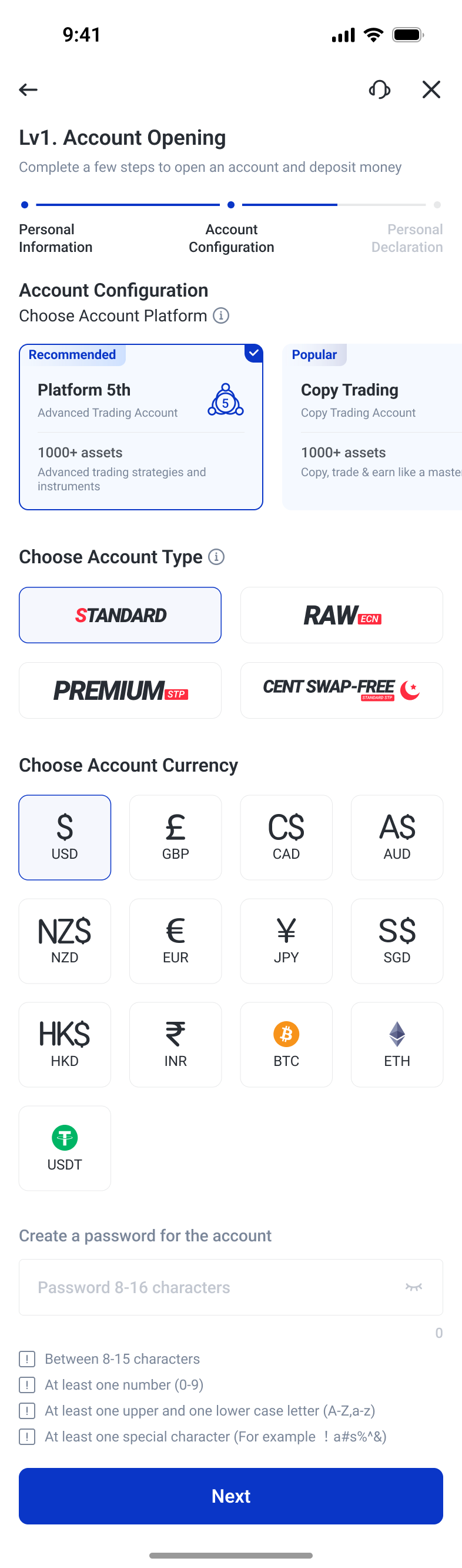
Separate the choices that define an account
Platform cards, account types, and currency options make different configuration decisions explicit. Password requirements stay beside the field while the progress indicator keeps the wider setup journey visible.
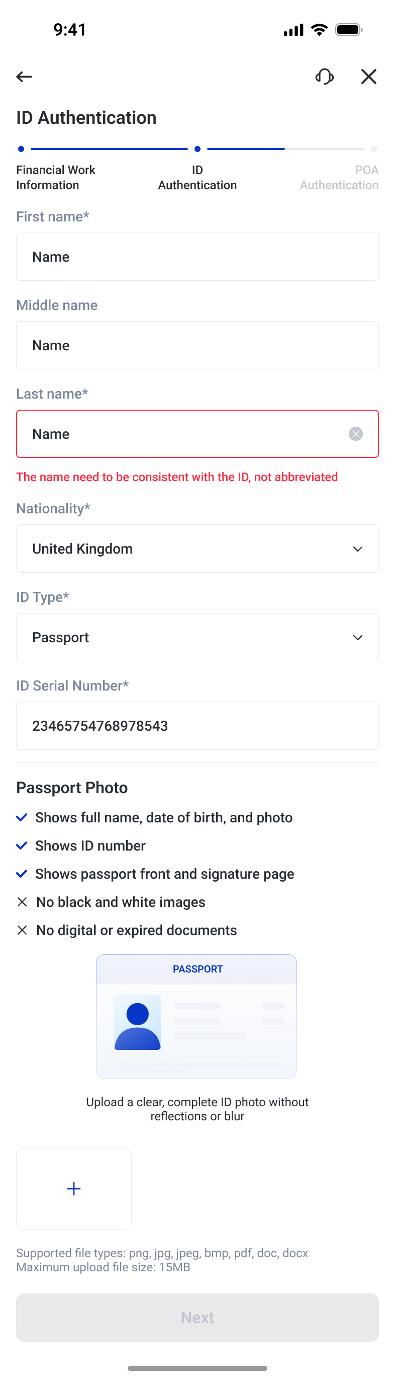
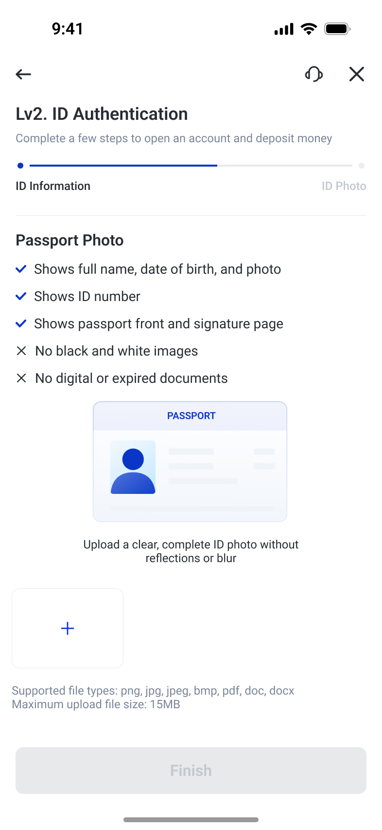
Explain requirements at the point of input
Identity fields show local feedback and contextual requirements. The upload step combines a document example, image requirements, supported formats, and file-size limits before the user submits a document.
Core trading workflows
From market discovery to order management, the app keeps the information and controls needed for each trading stage together. Copy trading, funding and account security extend the same approach across related tasks.
From market discovery to a trading decision
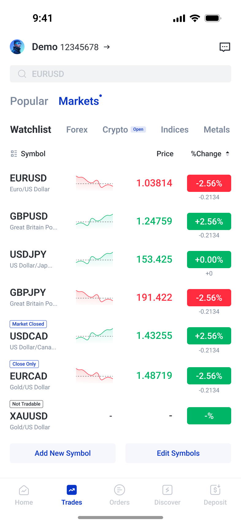
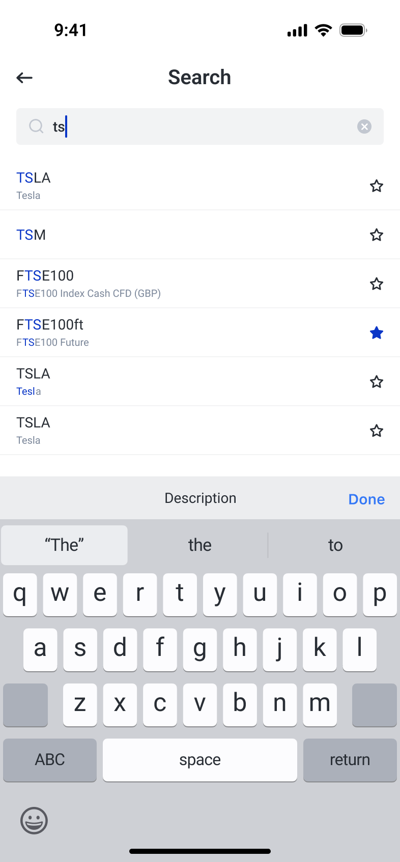
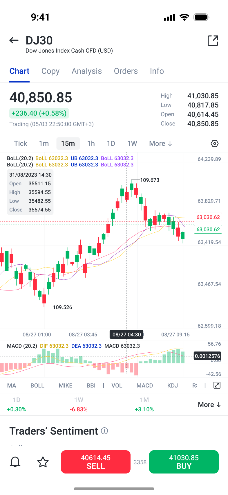
Market discovery needs to support both quick scanning and deliberate investigation. Categories and an editable watchlist organise instruments, while search highlights matches and provides a direct way to add them. Charts bring timeframes, indicators, and trading actions together; the economic calendar adds event context. Price alerts extend this workflow beyond the active session, with instrument-based management and explanations beside the condition selector. The chapter follows how users find a market, assess it, and decide what to monitor next.
Find an instrument and make the list your own
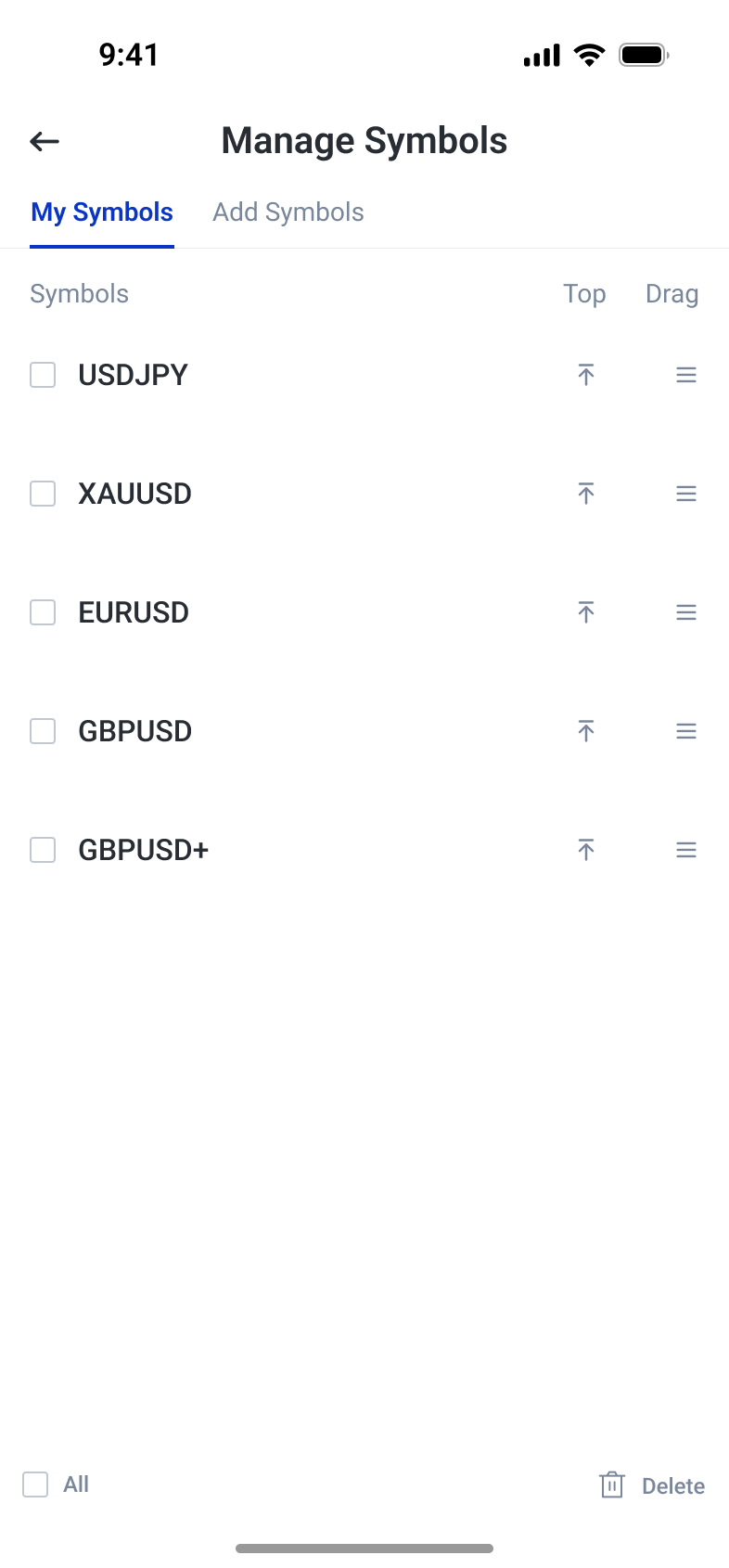
Search highlights matching text and keeps watchlist actions beside results. Symbol management separates selection, pinning, reordering, and deletion so the daily list can reflect a trader’s own priorities.
Connect price analysis with event context
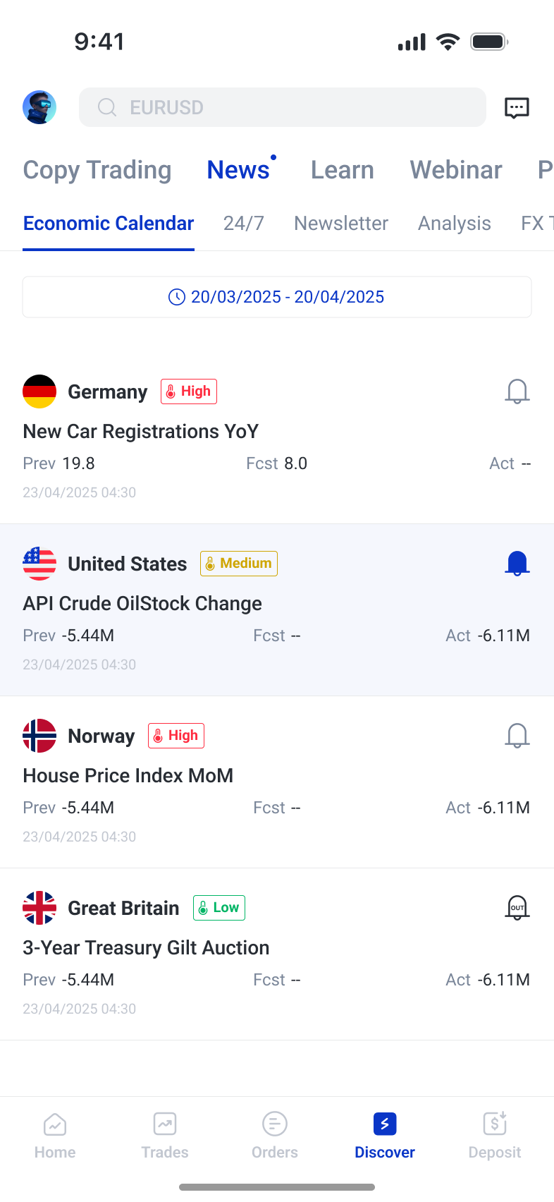
The chart combines analytical controls with a persistent buy and sell area. The calendar presents event timing, impact, and previous, forecast, and actual values as a separate source of context.
Monitor conditions without staying on the chart
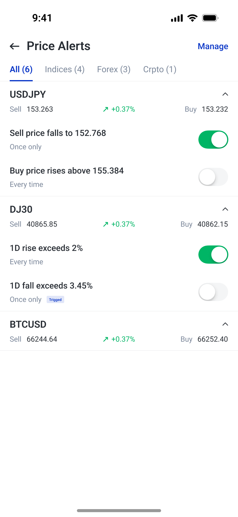
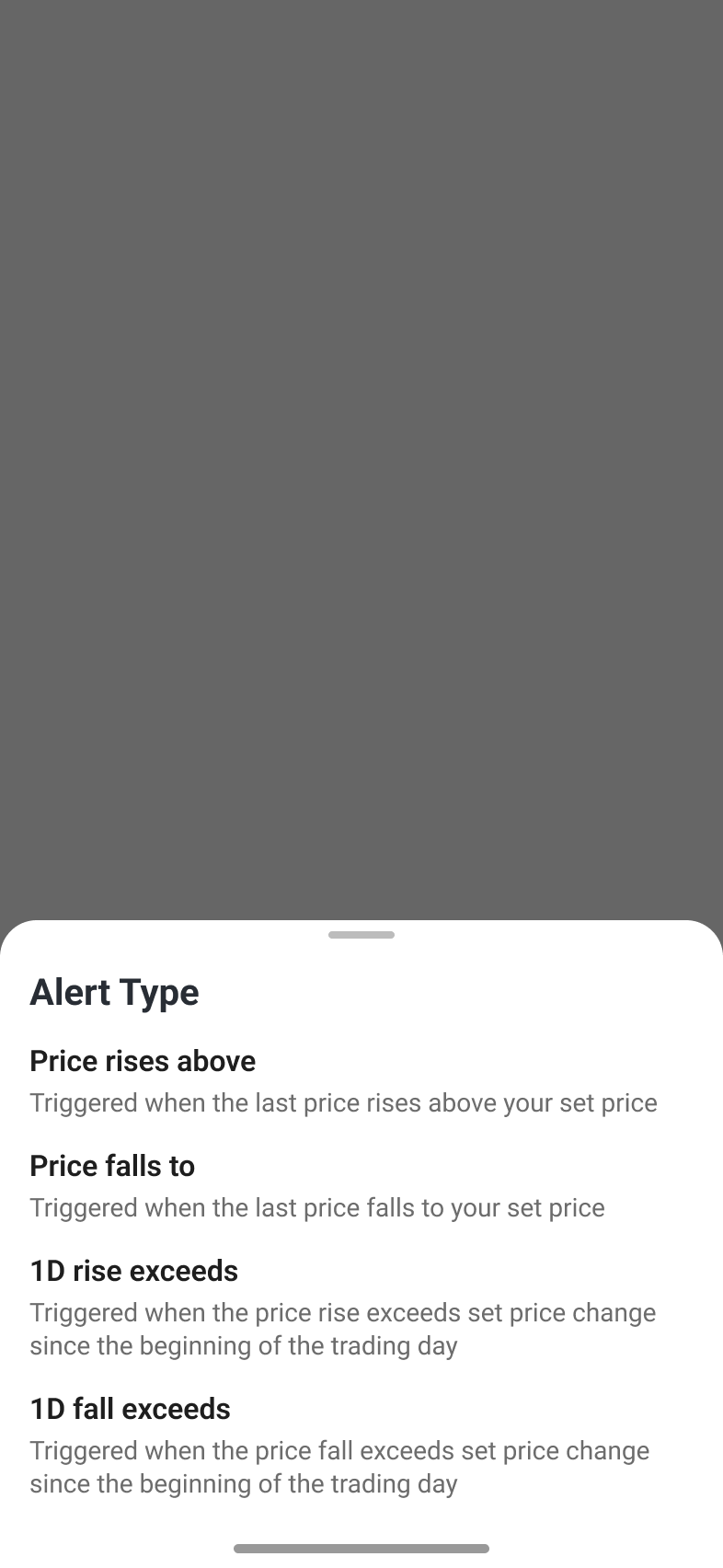
Alerts are grouped by instrument and can be switched on or off individually. The condition selector explains price thresholds and daily percentage changes in place, making the trigger logic visible before selection.
Make trade conditions visible
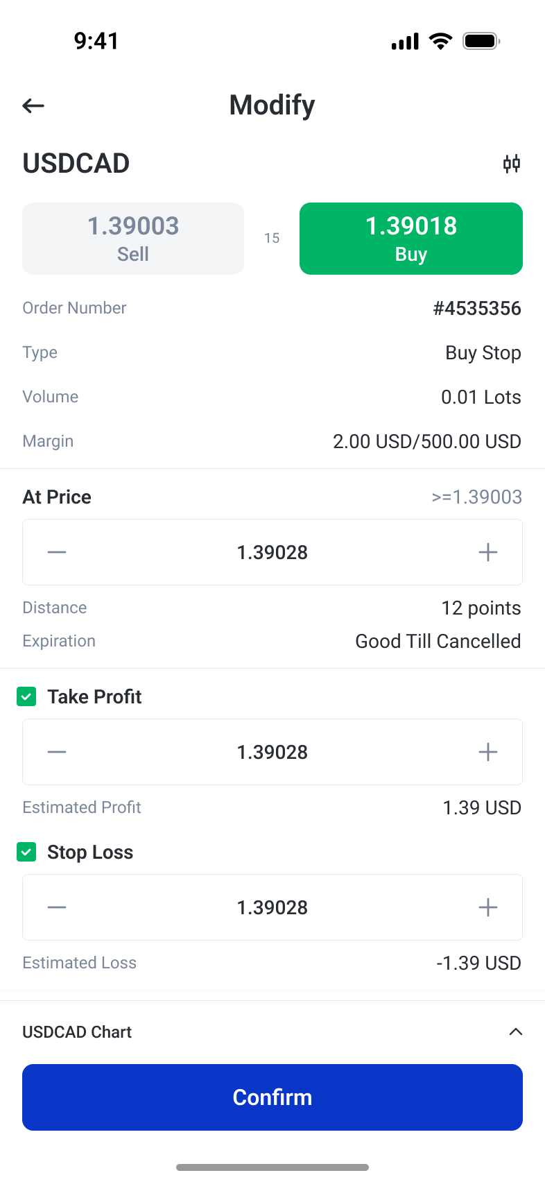
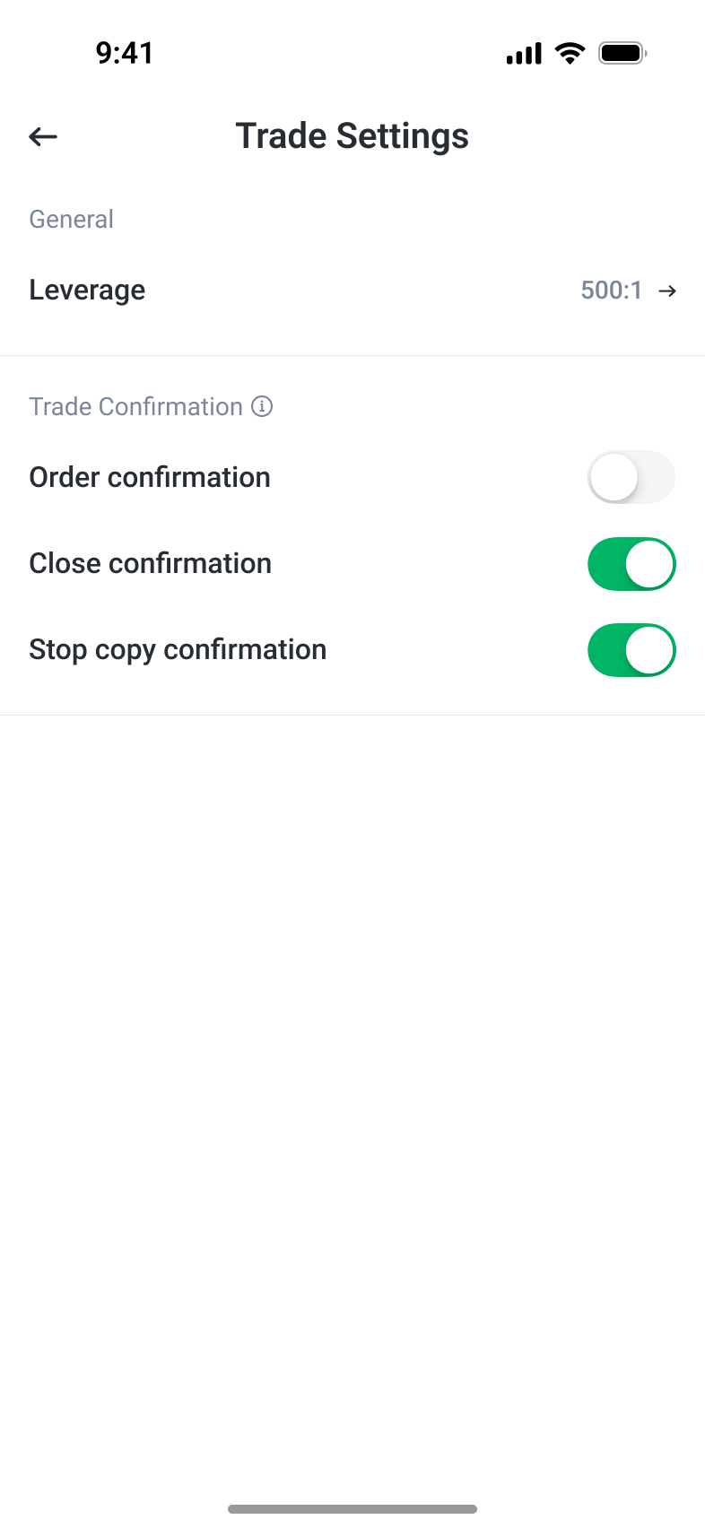
Order entry keeps direction, size, margin and exit conditions together, while expandable controls reveal complexity only when needed. Traders can choose a volume unit, compare order types, and define a pending order through its trigger, limit price and expiry. Contextual explanations support those choices inside the task. Modification retains the same information order for a familiar review. Separate confirmation settings for opening, closing and stopping a copy let repeated actions follow explicit preferences without hiding what each action changes.
Order size in context
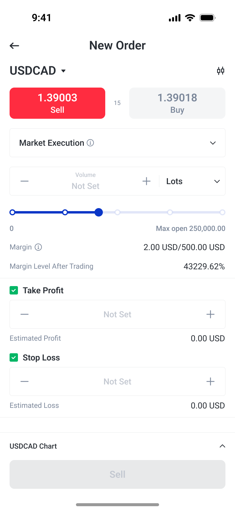
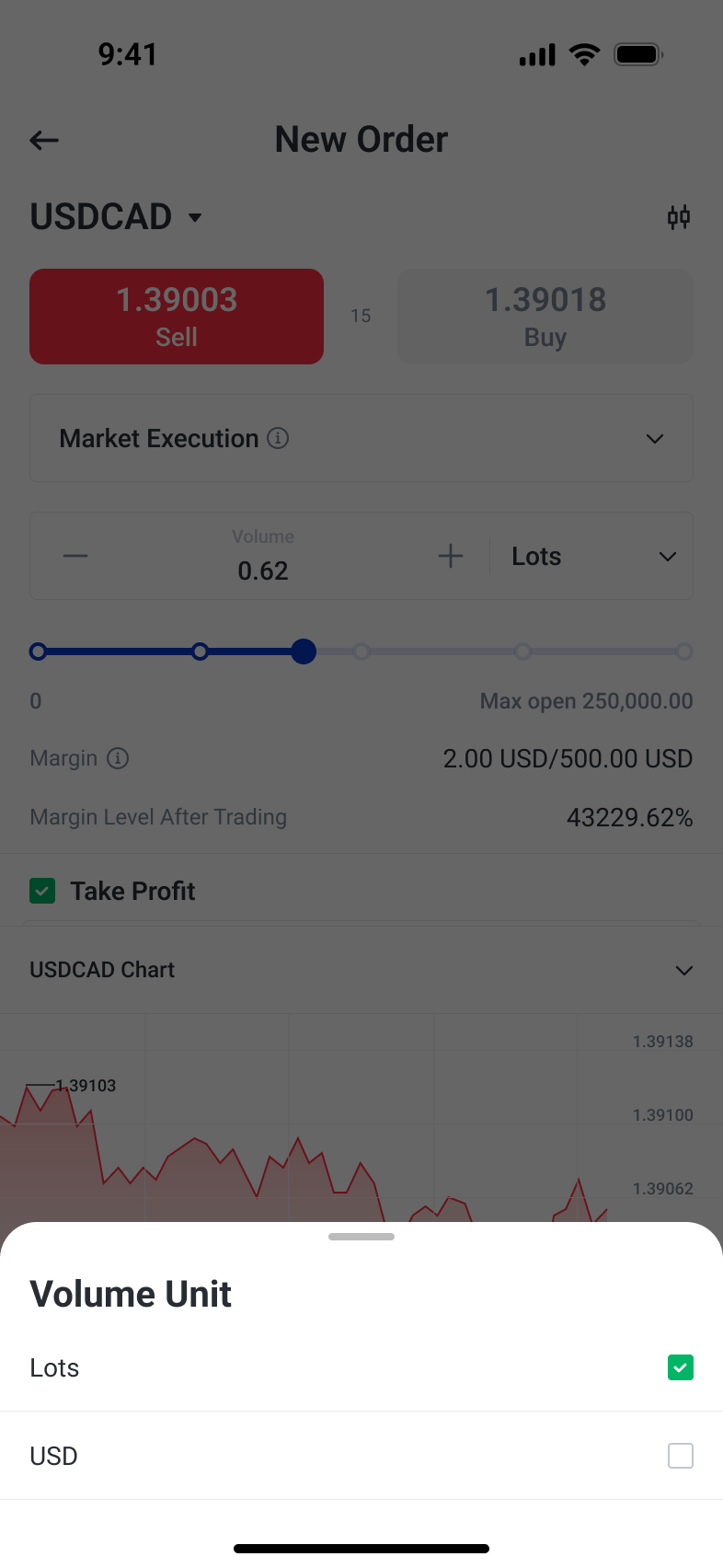
Keep live prices, size and margin in one visual sequence. A separate unit selector makes the input basis explicit before a trader commits to an amount.
Progressively reveal order conditions
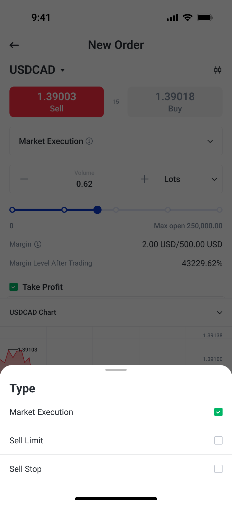
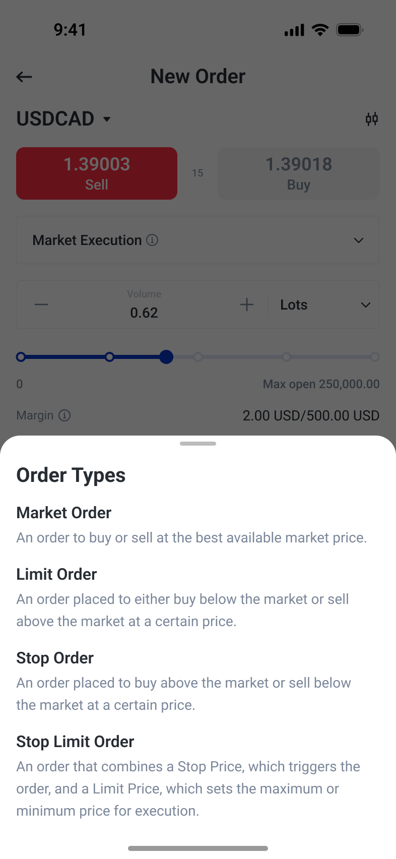
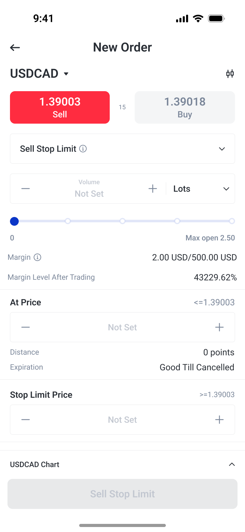
Select the order type first, then expose the fields that define it. Inline explanations and separate trigger, limit and expiry controls make conditional orders easier to inspect.
Keep changes and confirmations explicit
Modification preserves the familiar quote-to-condition structure. Confirmation preferences are separated by action so traders can control repeated opening, closing and stop-copy prompts independently.
Keep every trading stage actionable
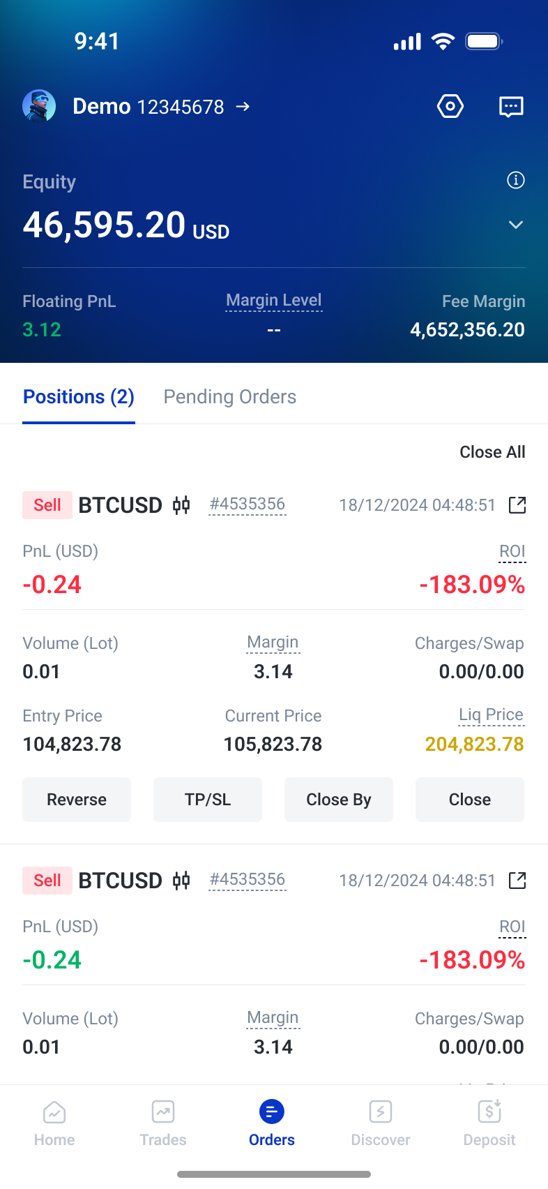
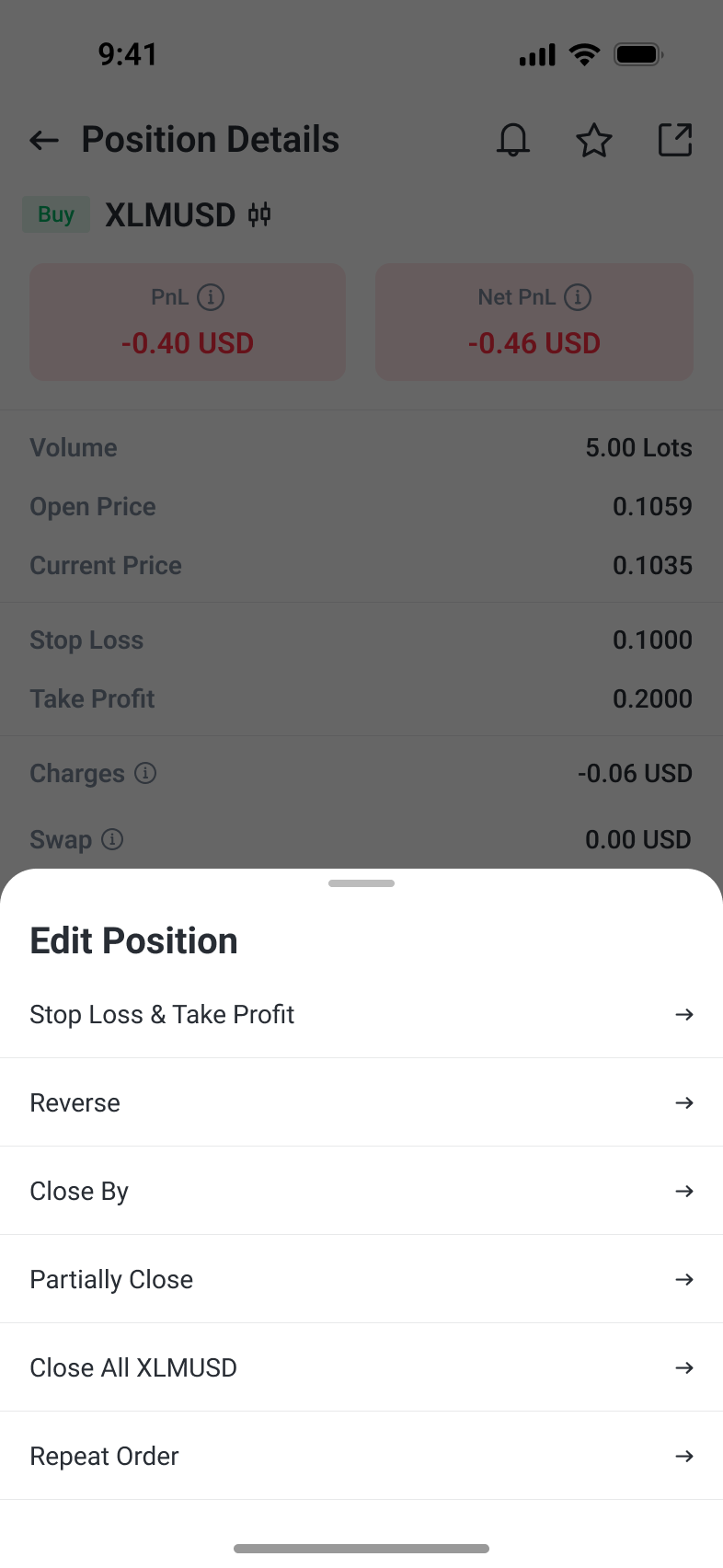
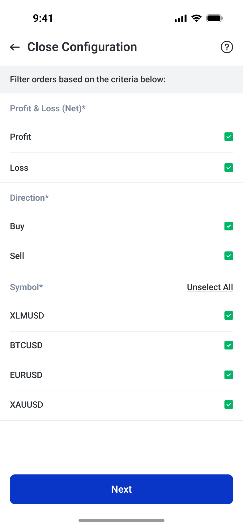
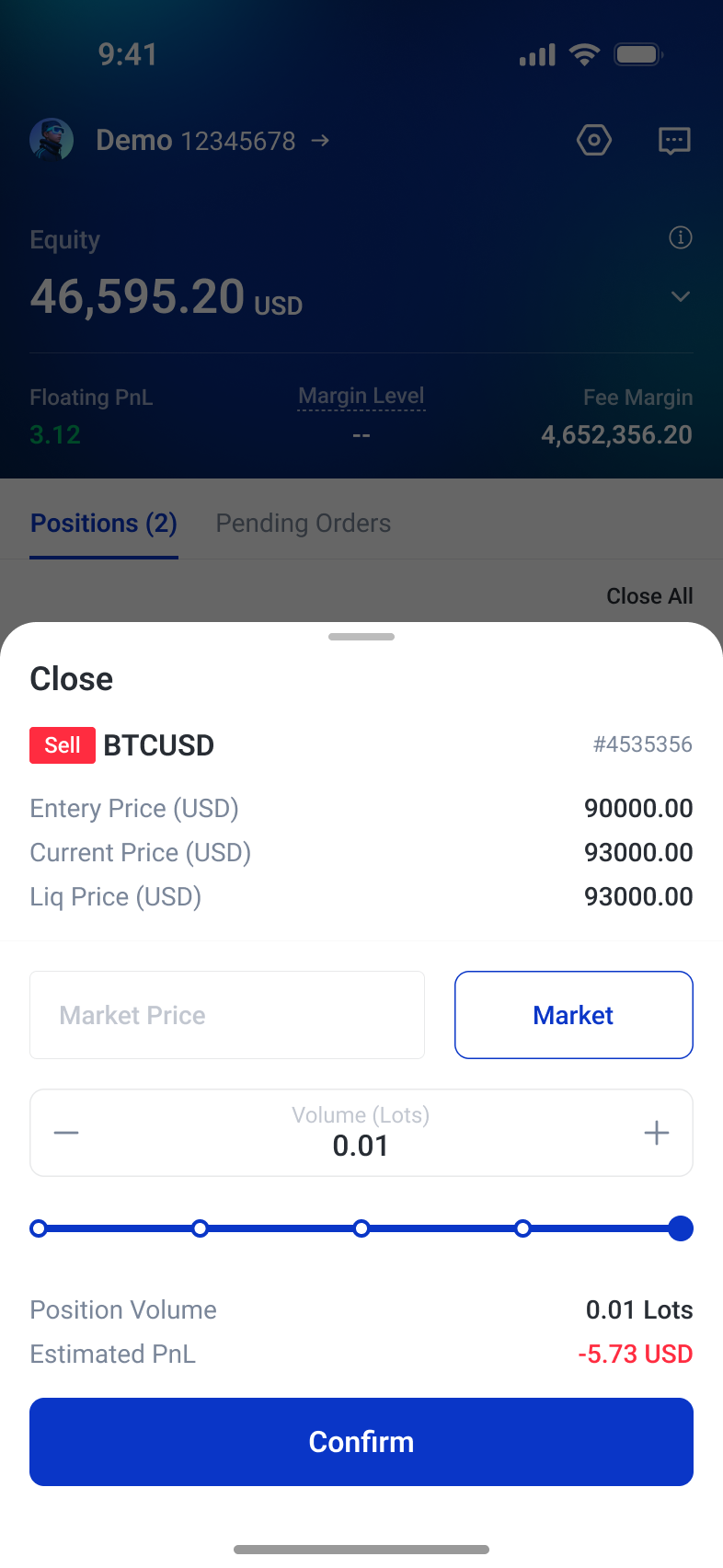
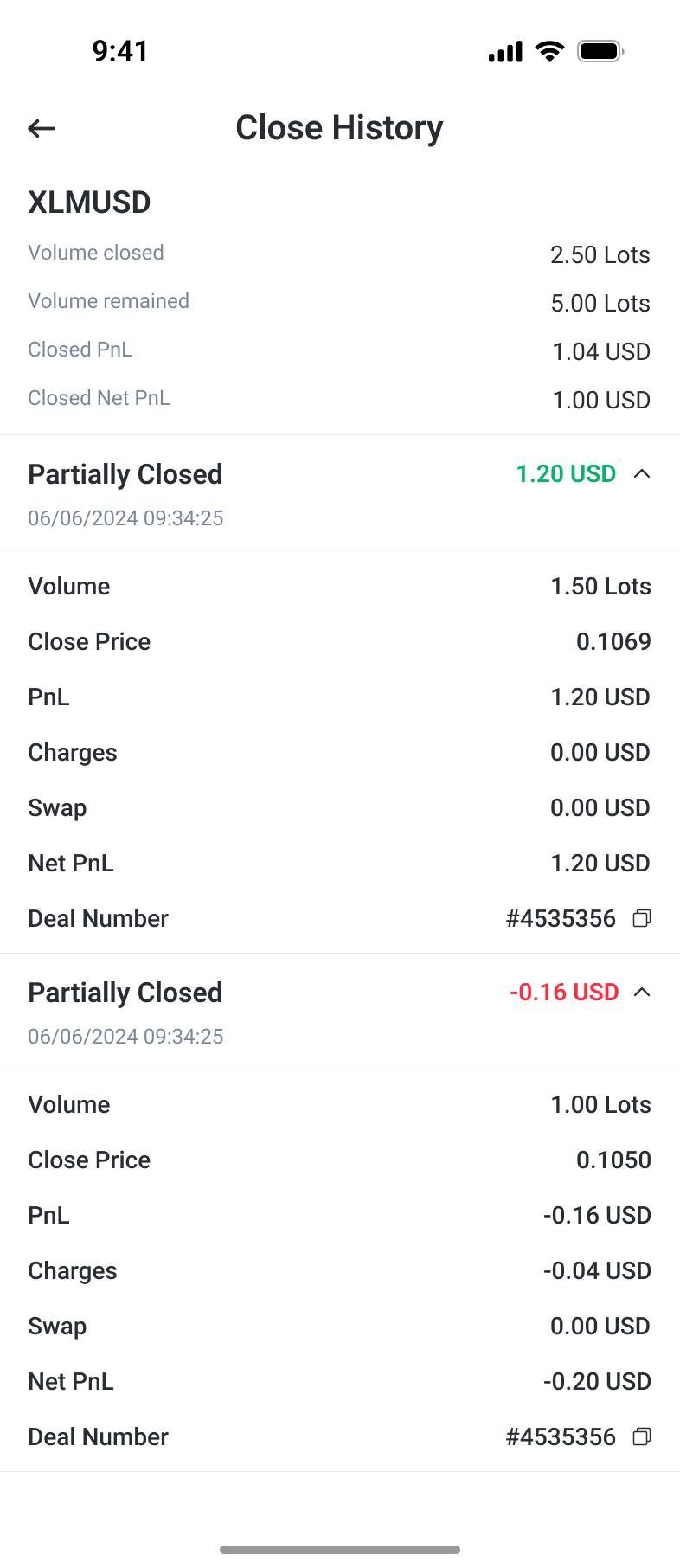
Order management distinguishes monitoring, adjustment and exit, with controls matched to the current trading state. Position cards expose performance and actions; a contextual menu keeps less frequent tools accessible without filling the main screen. Take-profit and stop-loss editing retains entry and current prices for reference, while pending details focus on conditions. Exit tools range from an individual volume control to filters for multiple positions. Partial-close history then separates closed volume, remaining exposure, charges and net results for later inspection.
Monitor first, act in context
Position cards keep account context and active exposure visible. A contextual action sheet groups secondary tools around the selected position instead of repeating them throughout the main screen.
Adjust controls to the trading state
Live positions expose exit-price and estimated-result controls. Pending orders instead emphasize trigger conditions, expiry and modification, making the available actions match what can still change.
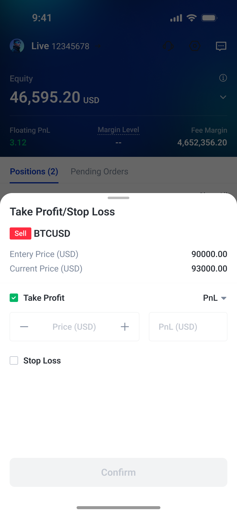
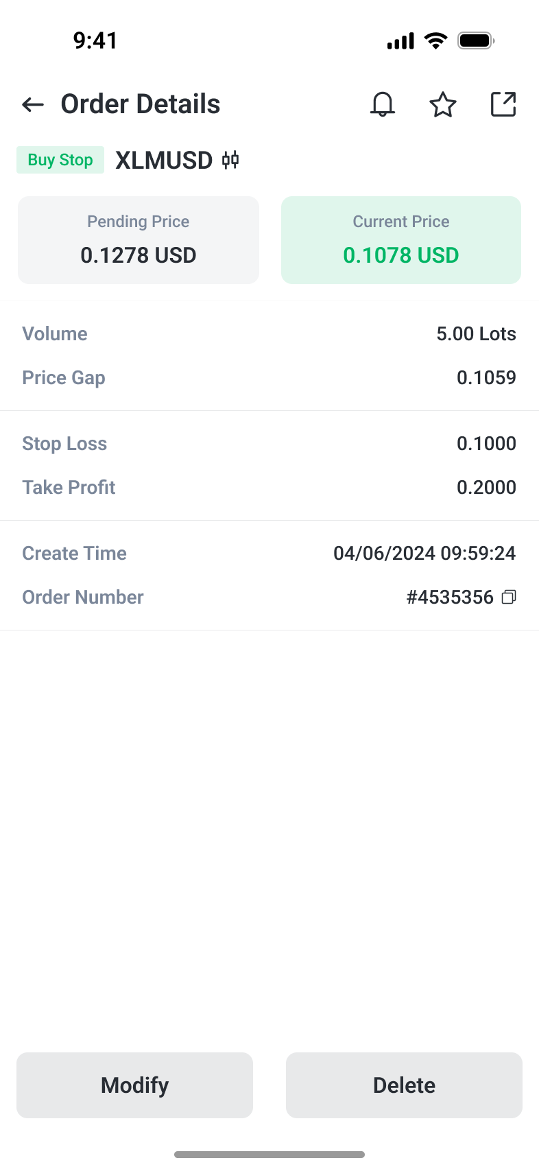
Scale exit control from one position to many
Use explicit filters to define a batch, or choose a volume for an individual close. The history view then separates completed deals from remaining volume, with charges and net results visible for review.
Understand a strategy before copying
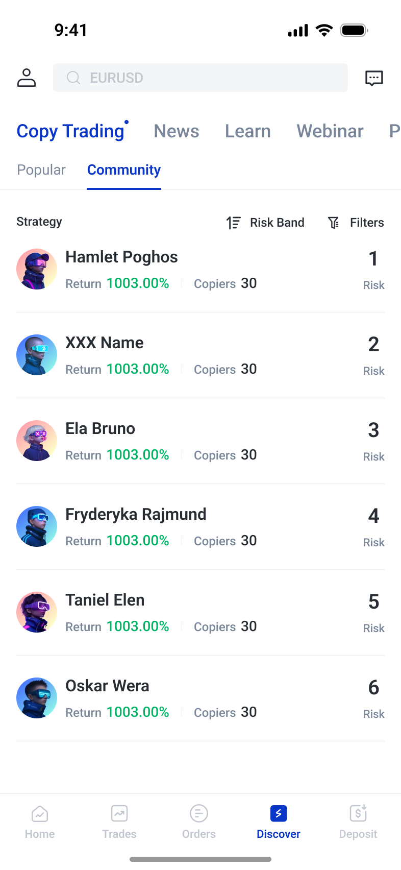
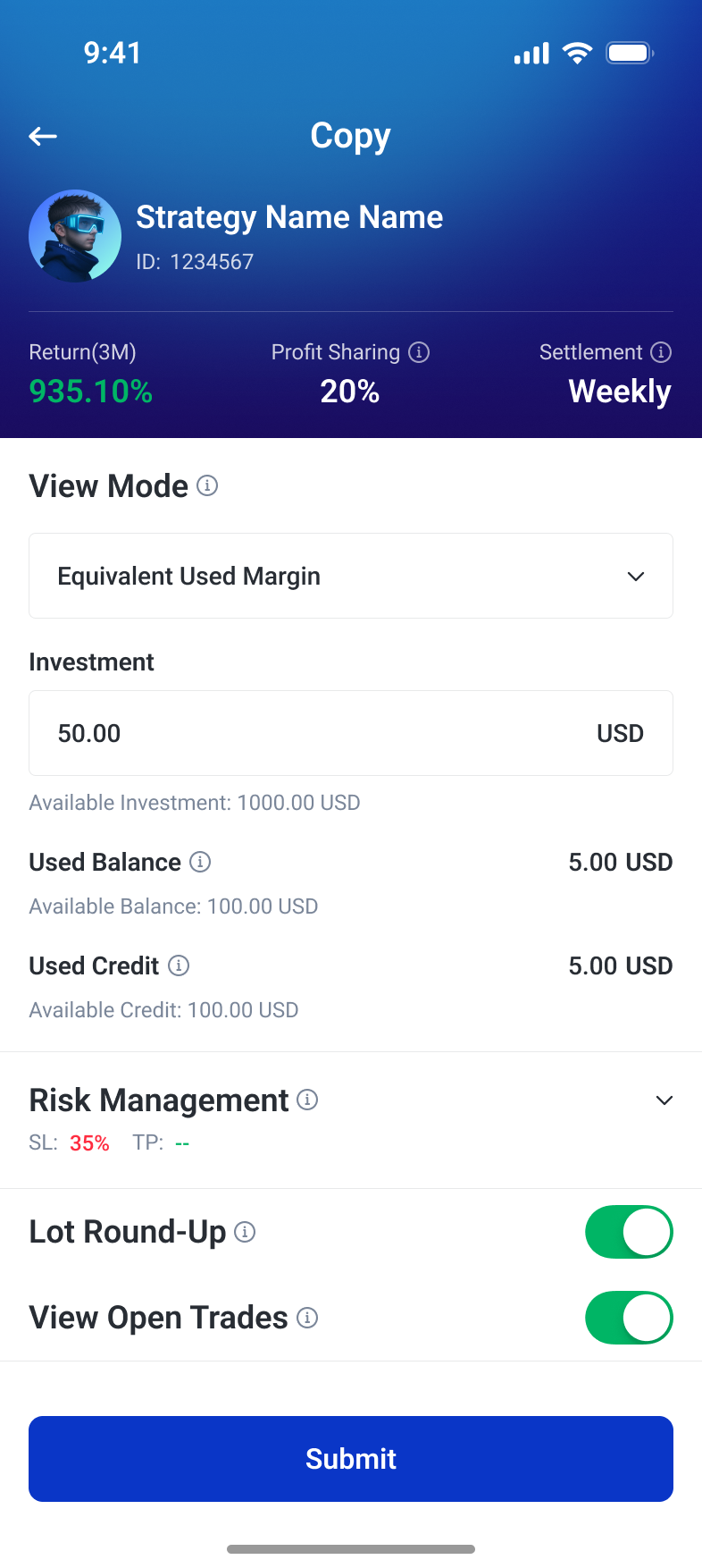
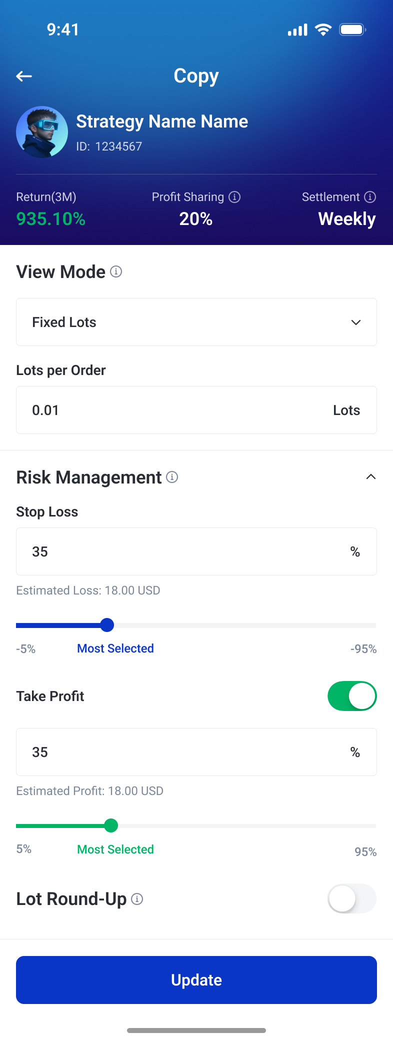
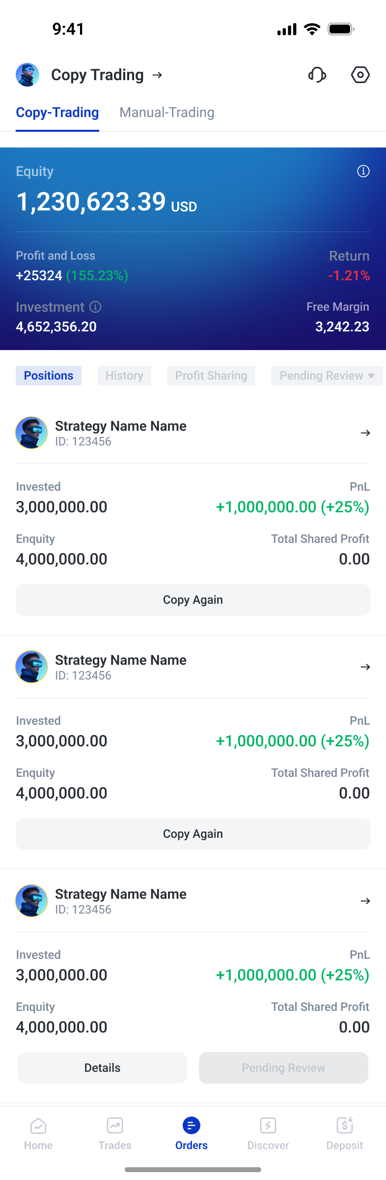
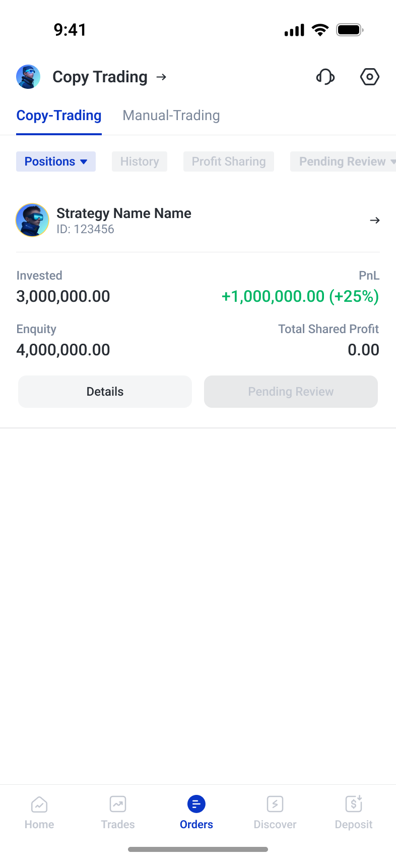
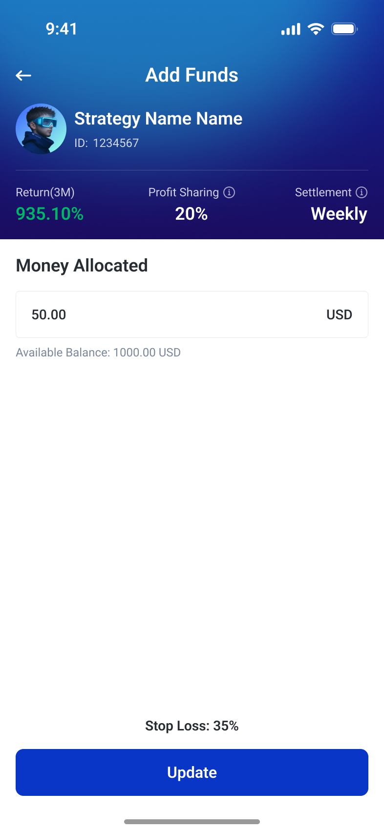
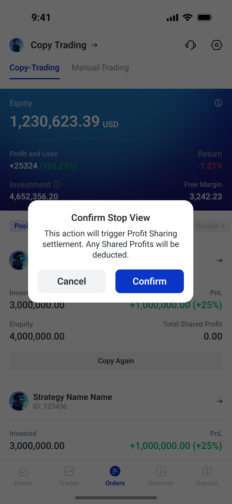
Copy trading extends beyond choosing a high-return strategy. Comparable risk signals lead into a deeper view of drawdown and trading behaviour. Before starting, investment, copy mode and loss limits are grouped into a single configuration. After submission, review status stays visible beside the strategy. Traders can add funds or revise copying rules as their needs change. Stopping a copy introduces a separate confirmation that explains profit-sharing settlement before the final action.
Compare before committing
The list supports comparison across risk, return and copier count. Strategy details add drawdown, trading distribution and settlement terms so the initial ranking is only the start of the decision.

Configure how the strategy is copied
Investment, balance use and risk limits are grouped before submission. Fixed-lot settings expose position size explicitly, with stop-loss, take-profit and lot-rounding controls kept in the same configuration.
Manage the relationship after setup
The strategy card surfaces review status alongside its available actions. Funding adjustments retain the strategy context, while the stop-copy dialog explains that profit-sharing settlement is triggered before users confirm.
Make funding conditions visible
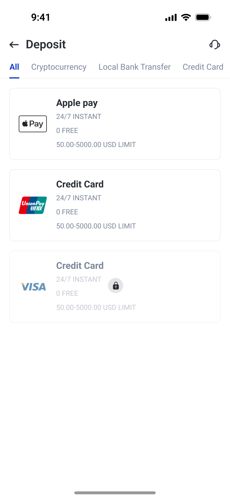
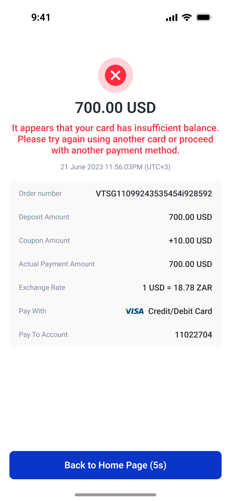
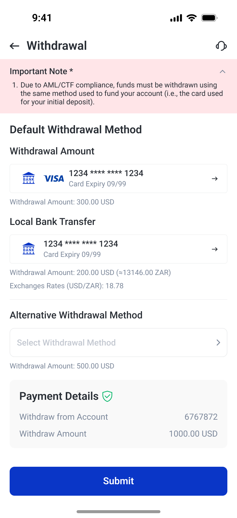
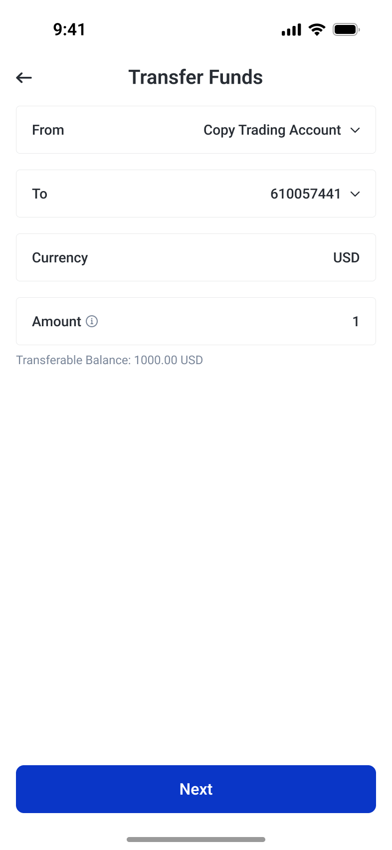
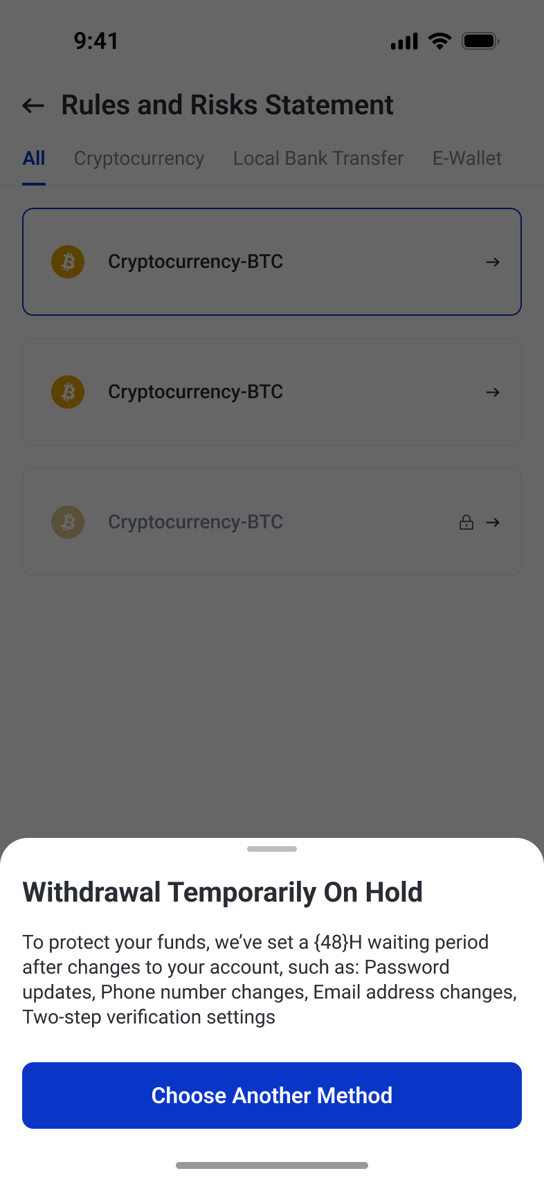
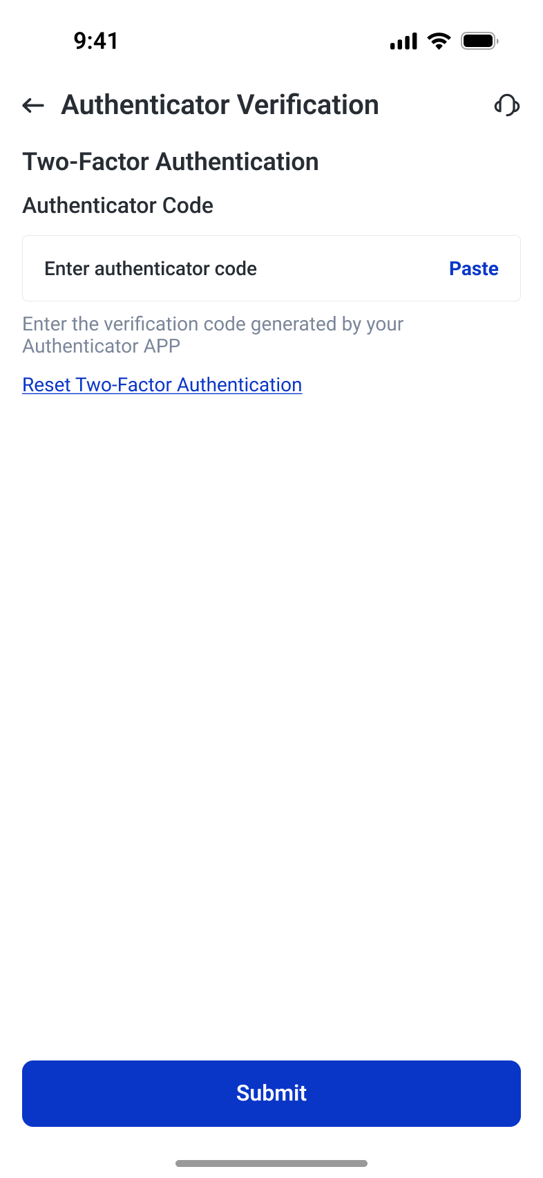
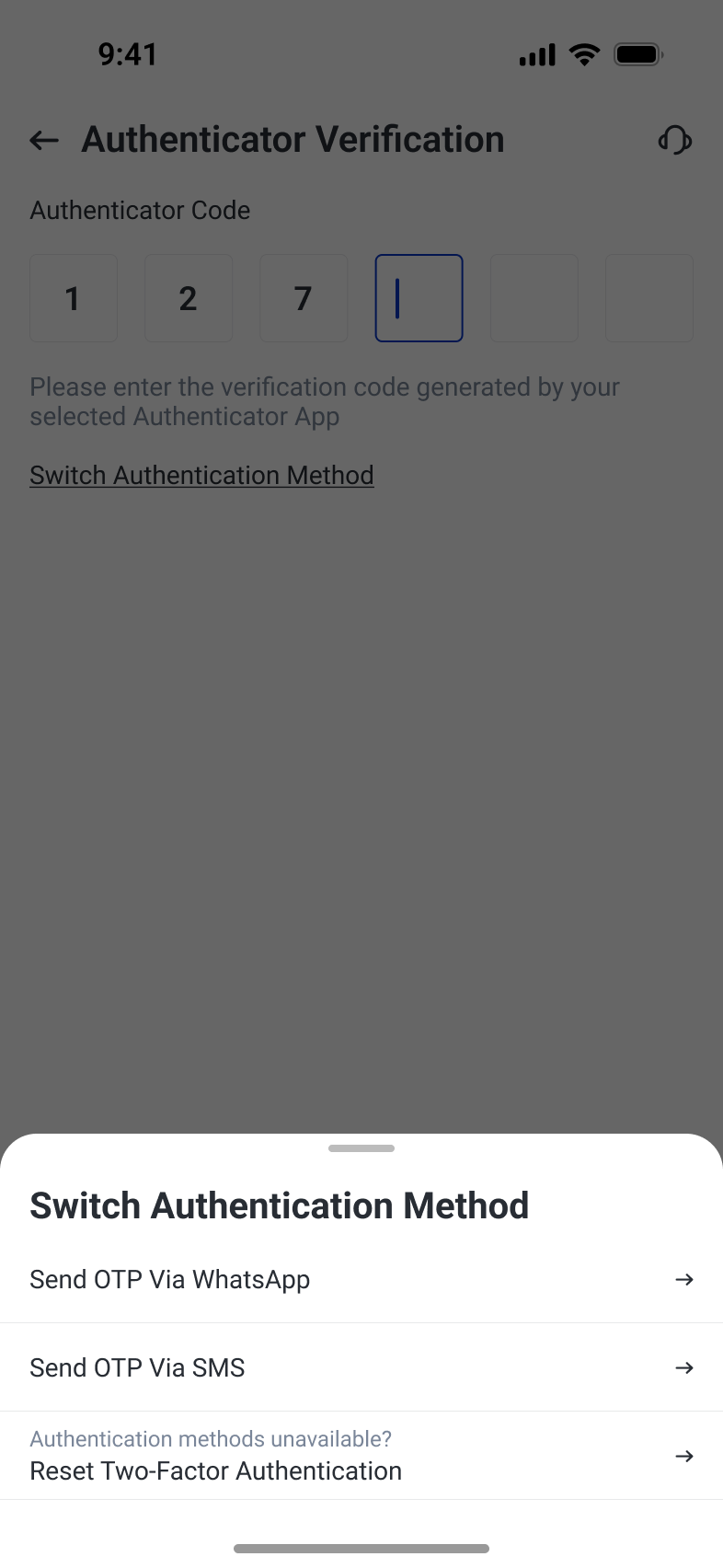
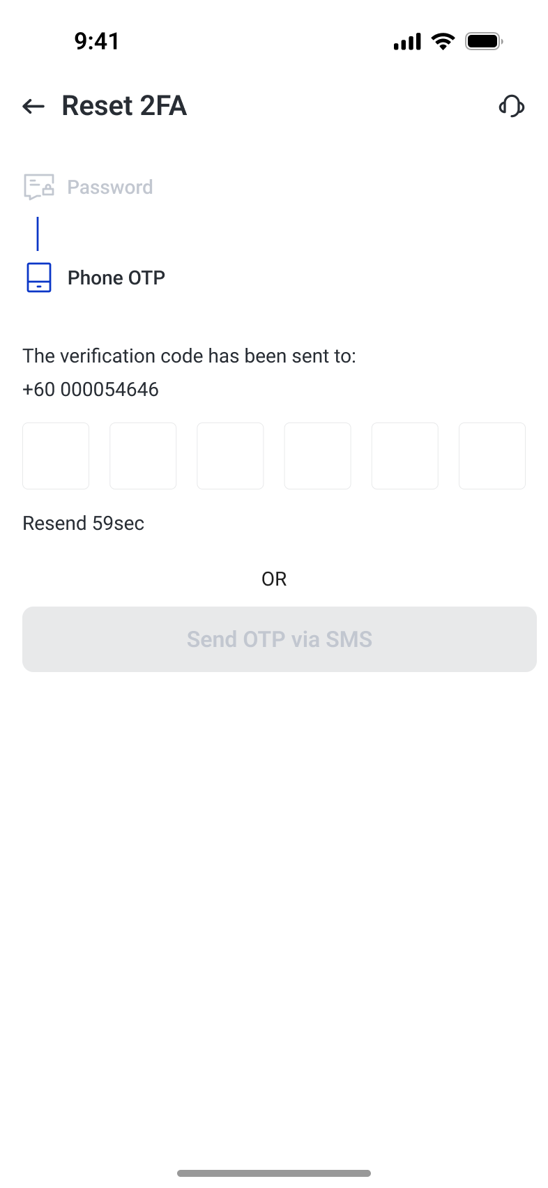
Funding combines payment choice, account movement and security checks. Method cards surface timing, fees and limits before selection; payment feedback explains a failed card charge. Withdrawal review collects destinations and amounts, with conditional holds explaining why an action is unavailable. Transfers keep source, destination, currency and balance visible together. Authentication offers alternative delivery methods and a staged reset route, so users have a next step when their usual verification method is unavailable.
Choose a method and understand the outcome
Method cards use the same structure for timing, fees and limits. A declined-card state explains the failure and suggests another card or payment method, keeping the reason close to the transaction details.
Make movement and restrictions explicit
Withdrawal review groups destination and amount information, while transfer entry shows both accounts and the transferable balance. A separate hold message explains the security-related waiting condition before an unavailable action.
Provide a path when verification is unavailable
Authenticator entry names the source of the code. Alternative WhatsApp and SMS routes remain separate from account recovery, where password verification precedes the phone-code step.
A shared system across themes and regions
Shared foundations and components connect the app across workflows. Theme variants, translated labels and regional preferences extend that system to different contexts.
A system for a complex trading product
The interface system connects visual foundations, interaction states, navigation and business components. Type sizes and line heights distinguish primary values from supporting information. Shared input and feedback patterns give each state a recognizable form. Order controls and position cards carry those patterns into trading tasks. Light and dark variants preserve the same information structure, so themes change the presentation without changing how a task is organized.
Visual hierarchy before decoration
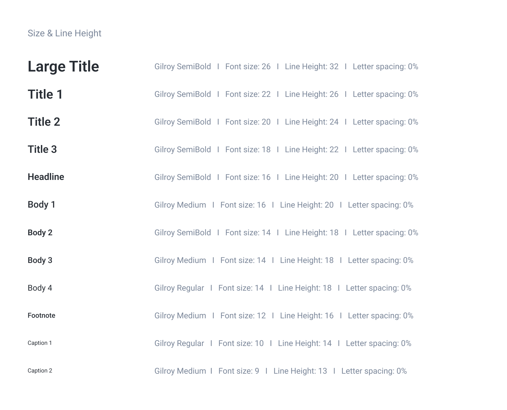
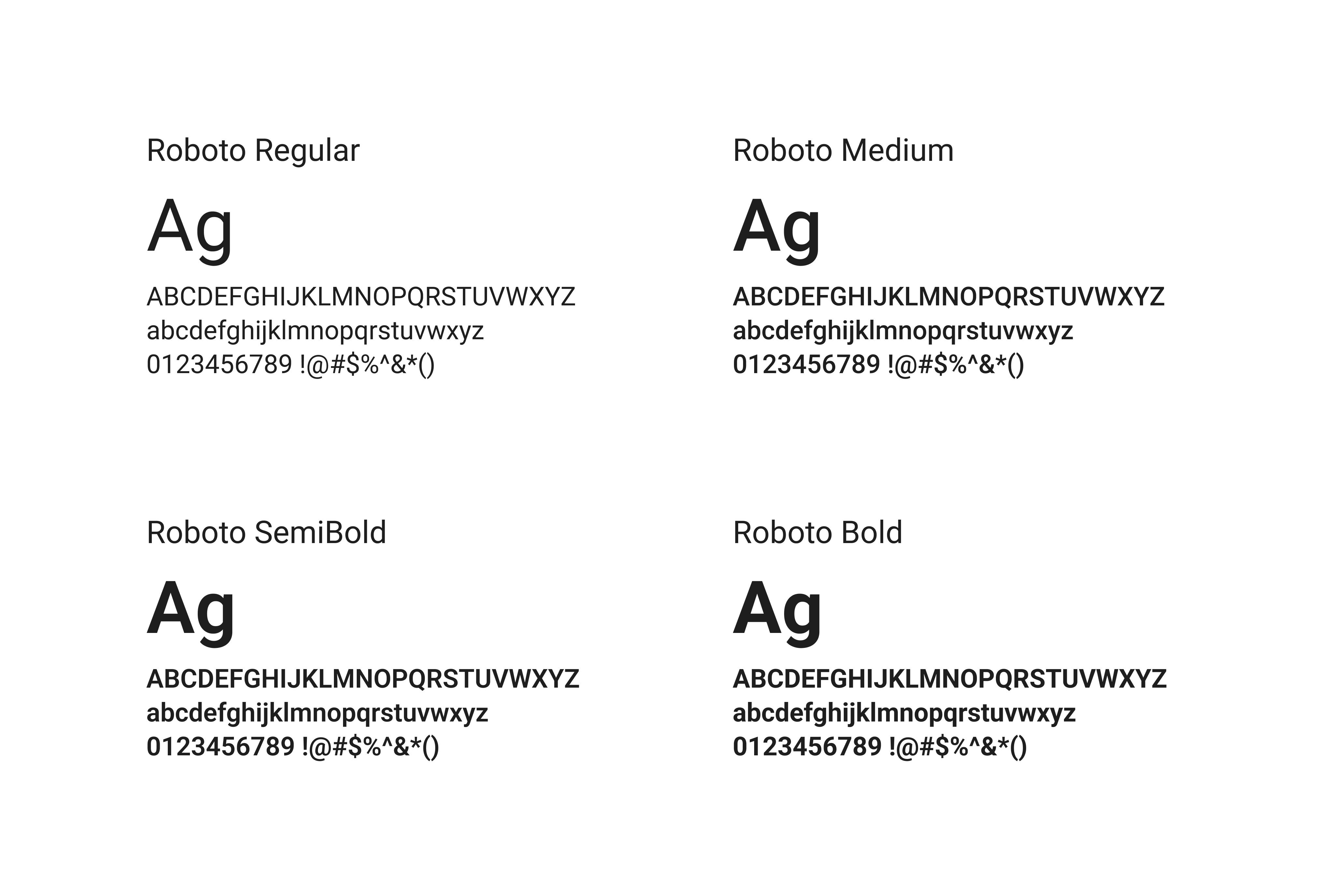
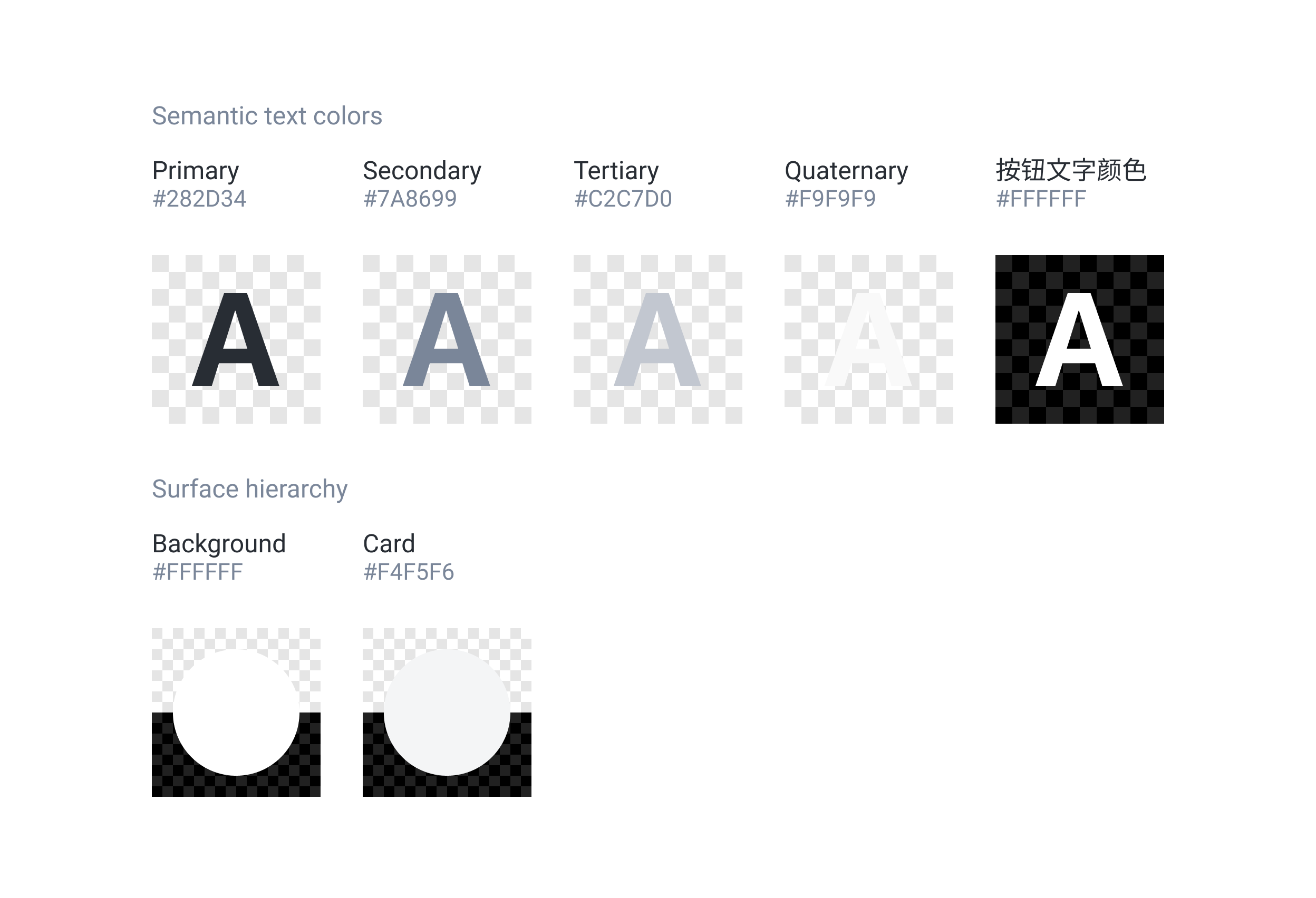
Type sizes, line heights and weights establish a repeatable hierarchy for titles, values, labels and notes. Semantic text and surface colors distinguish importance and grouping across dense financial information.
Design the state, not only the field
Default, focused, error and disabled states share one field structure. Password visibility uses the same control geometry, keeping a familiar input pattern while allowing users to inspect sensitive text.






Reusable navigation and feedback
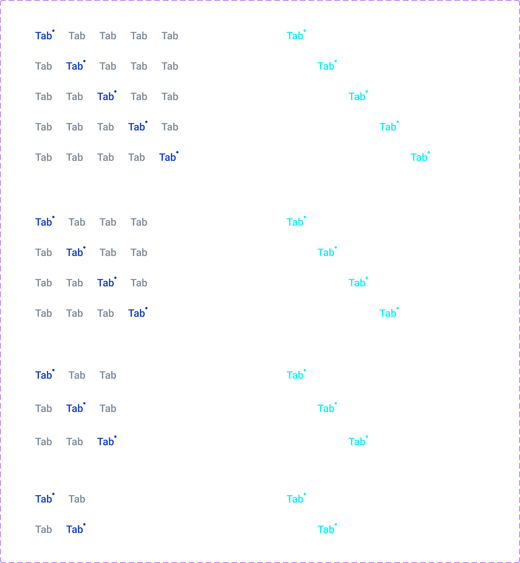
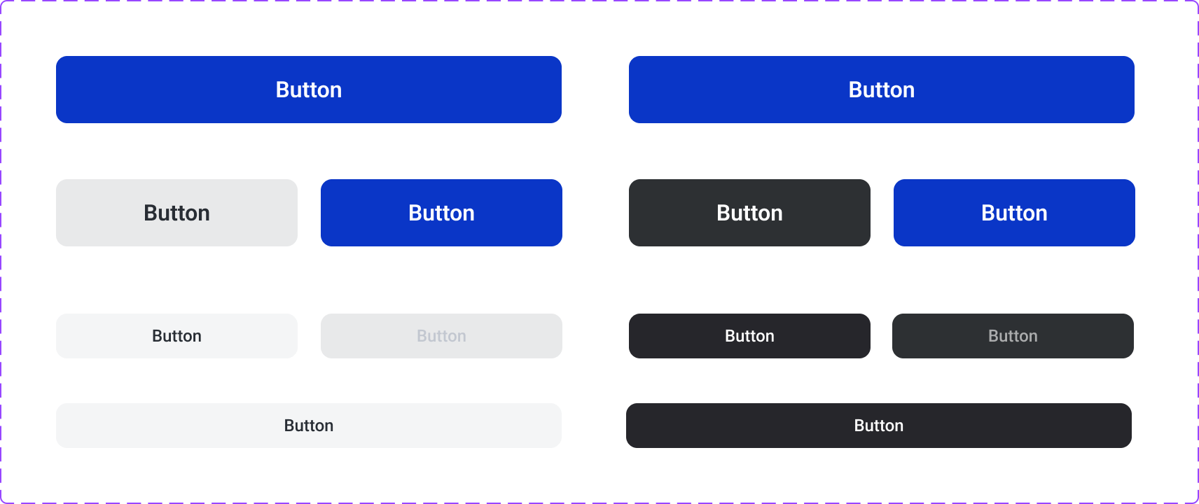
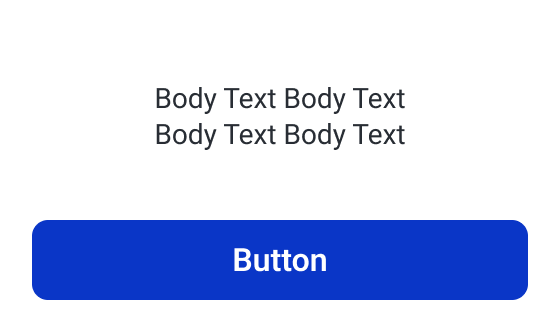
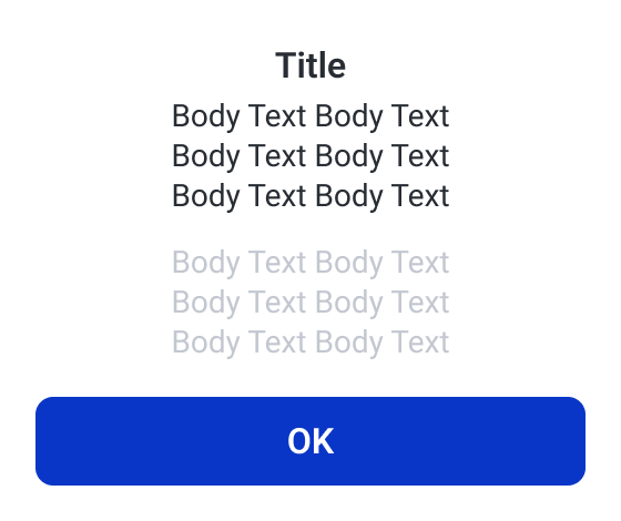
Shared navigation variants define selection across light and dark themes. Order buttons establish action hierarchy, while compact and expanded dialogs provide consistent containers for different amounts of supporting content.
Business components, consistent structure
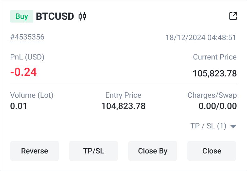
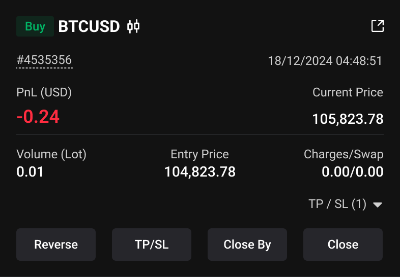
The position card brings trade identity, performance and actions into one reusable pattern. Light and dark variants preserve the order and placement of these elements, providing a concrete link between the component library and the trading screens.
Designing across languages and regions
Internationalization changes more than the wording. The source designs explore native language names, country selection, translated button widths, compact labels and text overflow. These patterns make translation length a visible layout concern. Regional privacy variants add another dimension: shared account security is retained while consent choices appear in a dedicated version. Together, the examples show how one interface can accommodate language and regional differences without rebuilding every pattern.
A recognizable language and country entry
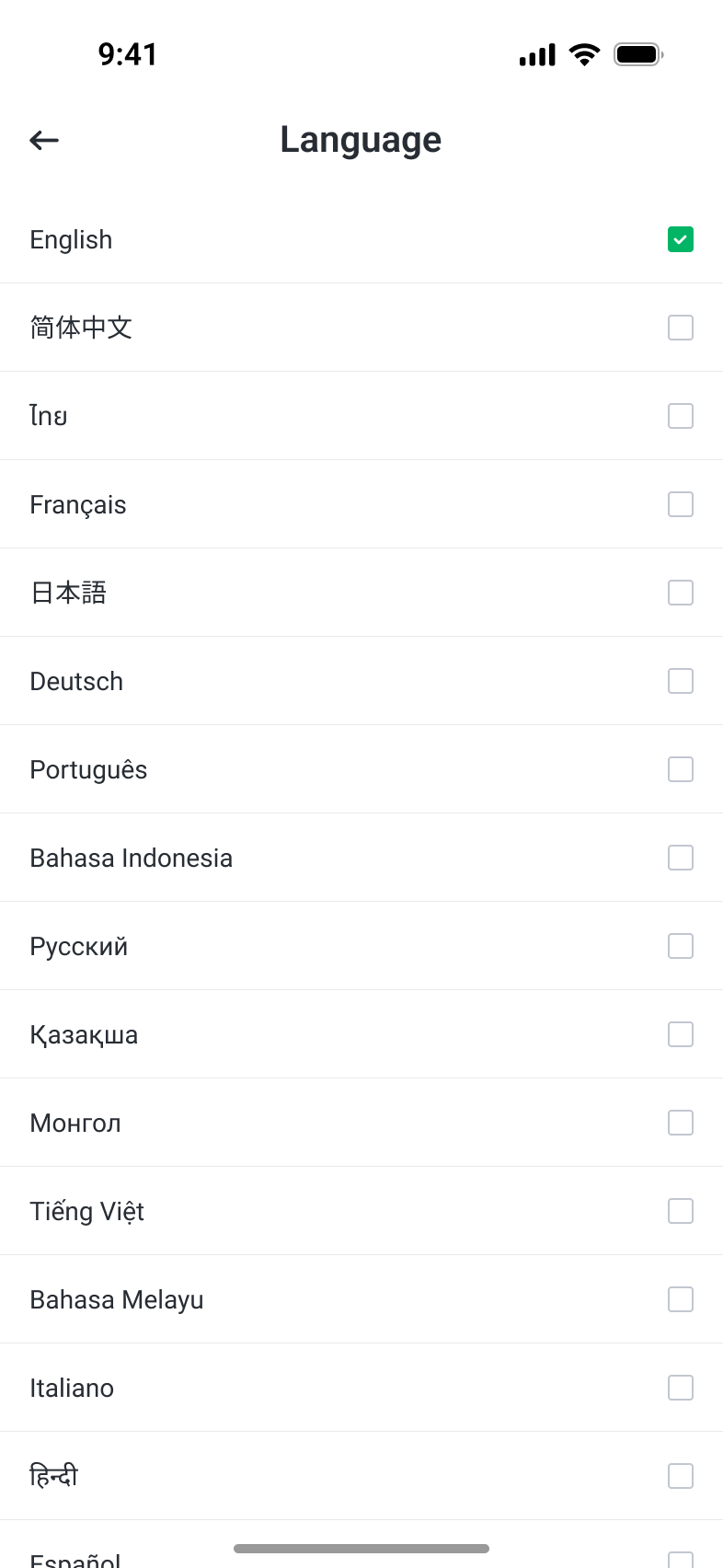
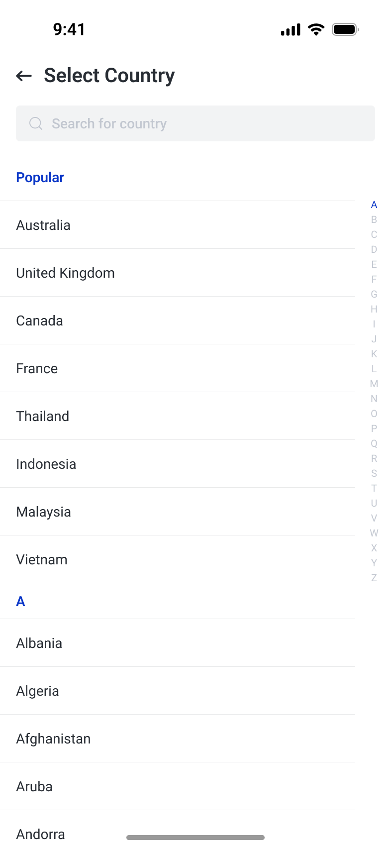
Language names appear in their own scripts, with the current selection marked explicitly. Country selection adds search, popular entries and an alphabetical list.
One action, different text lengths
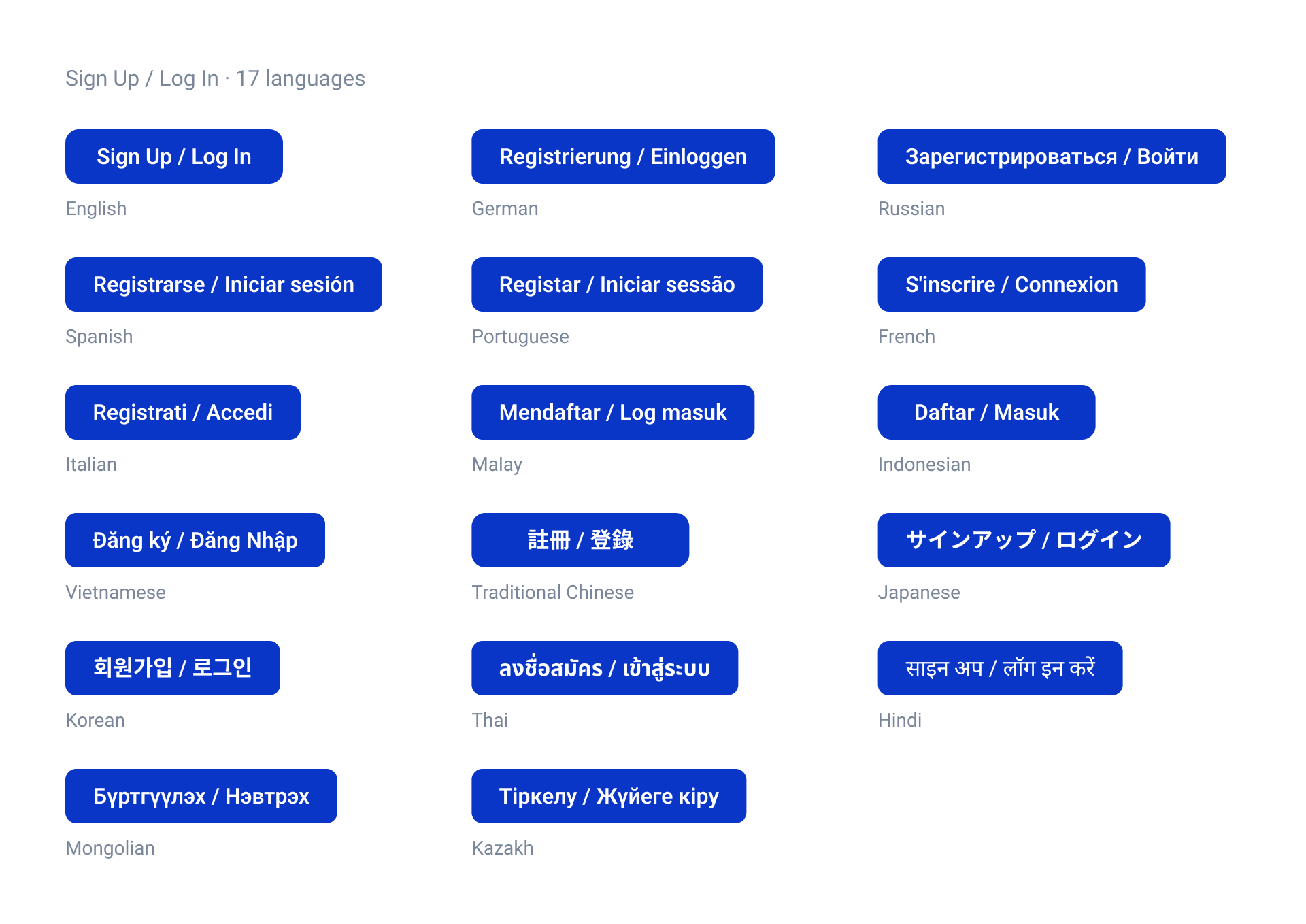
The sign-up and login study compares 17 language samples at a common 40-pixel height. Width changes with the translated label: the English sample is 160 pixels wide, German is 223 and Russian is 256. The specimens make expansion visible across Latin, Cyrillic and Asian scripts.
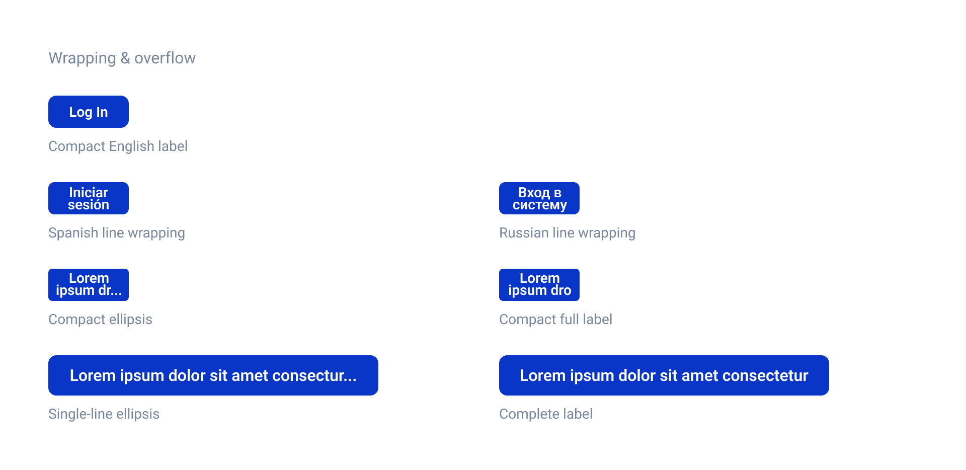
Specify wrapping and overflow behavior
Compact 80-by-32 login samples use two lines for longer translations. Separate specimens define full labels and ellipsis behavior for wider controls. These examples document layout choices rather than leaving each translated screen to resolve overflow independently.
Regional preferences within shared security
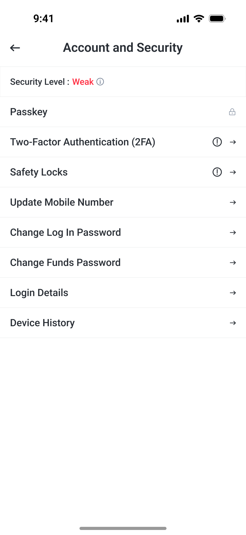
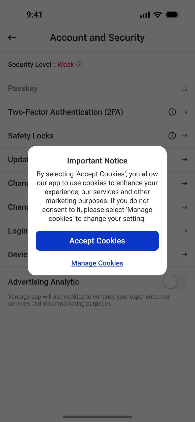
The general account-security screen groups passkeys, two-factor authentication and account controls. A source variant explicitly labeled for Europe adds Advertising Analytic and cookie choices. The regional difference is expressed within the same security structure, with acceptance and preference management presented as separate actions.